EDF Trading
Gas trading analytics tool redesign

At EDF Trading, I joined the team as the sole designer and was immediately challenged with two key objectives: to revolutionize the product development culture by implementing User-Centric Design practices, and to lead the transformation of EDF's Gas Balance tool from a clunky spreadsheet into a vital web application, significantly enhancing daily operations.
CLIENT

ROLE
Lead Product Designer
Responsibilities
#User Experience Design #User Research #Workshops #Stakeholder management #Wireframing #Prototyping #Data Visualization #High Fidelity UI #Visual Design

Global leaders in wholesale energy markets
EDF Trading specializes in the wholesale energy markets, operating globally with an asset-backed structure. It manages the entire supply chain from source to supply, dealing in wholesale power, natural gas, oil, LPG, environmental products, LNG and coal, in partnership with JERA Global Markets.
One step at a time
I hit the ground running when I started my journey at EDF, but before diving into the project, I faced an equally challenging task, I needed to convince the team of the value of Experience Design. I was brought into EDF by a very senior stakeholder who strongly supported the shift in design culture. However while he recognized the immense benefits of a User-Centered approach in developing digital tools, it was not his expertise; he needed someone who could effectively communicate and demonstrate these principles and their value to the broader team which was unfamiliar such concepts... that's where I stepped in.
Planting the seeds
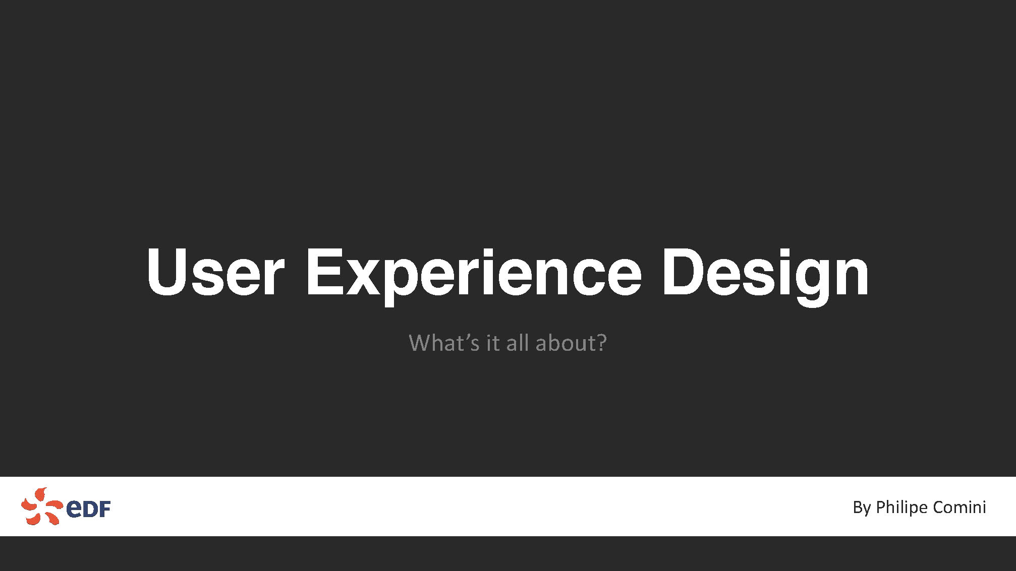
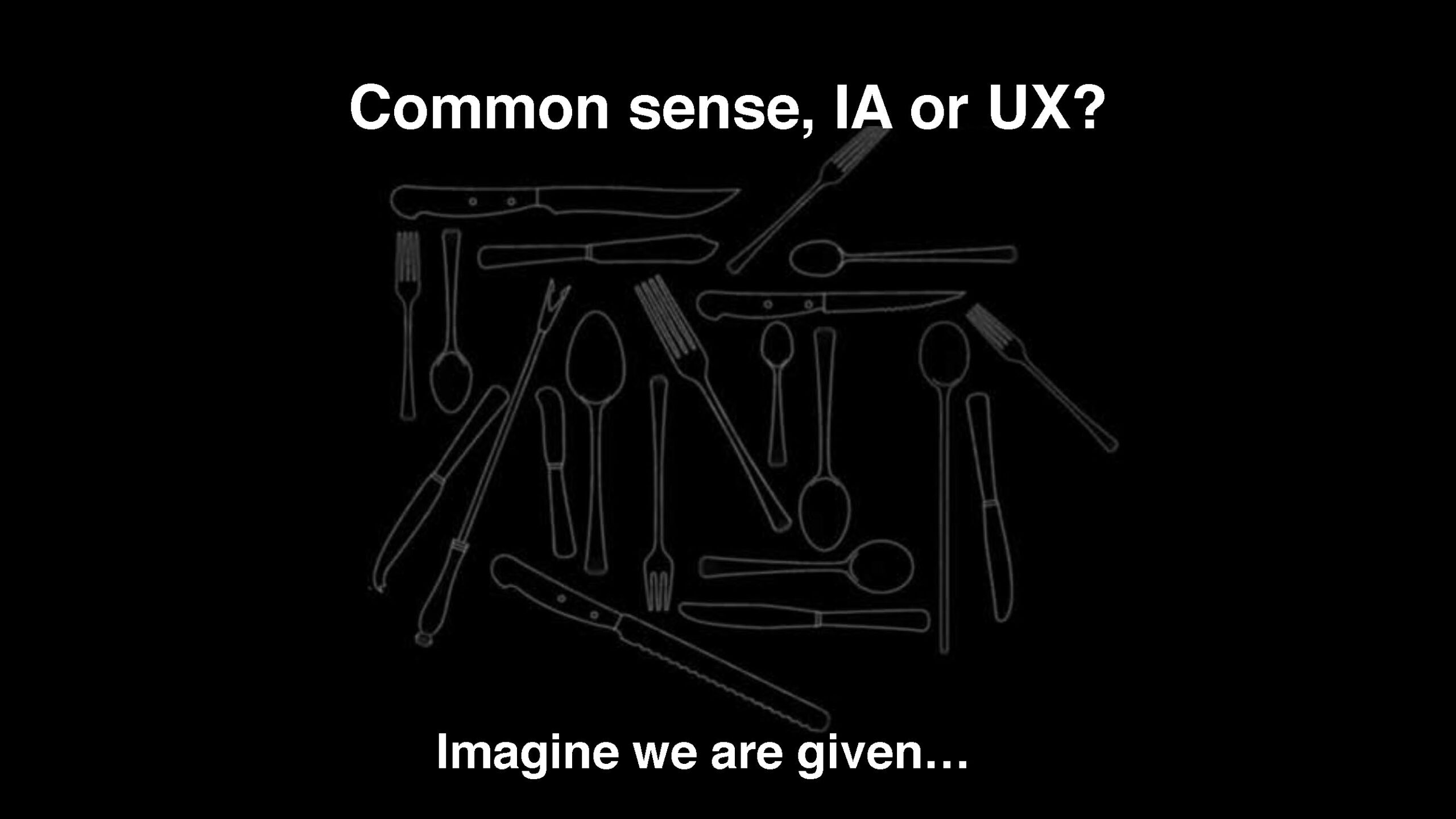
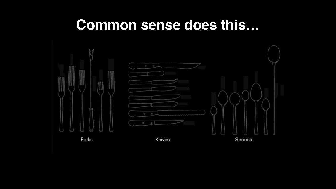
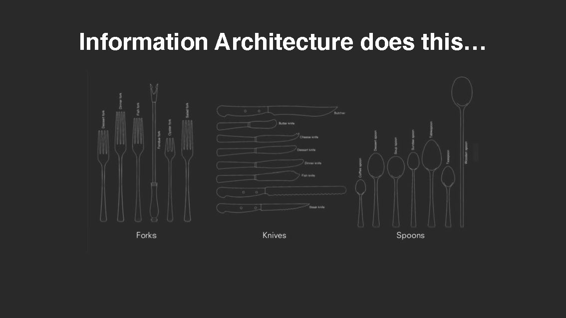
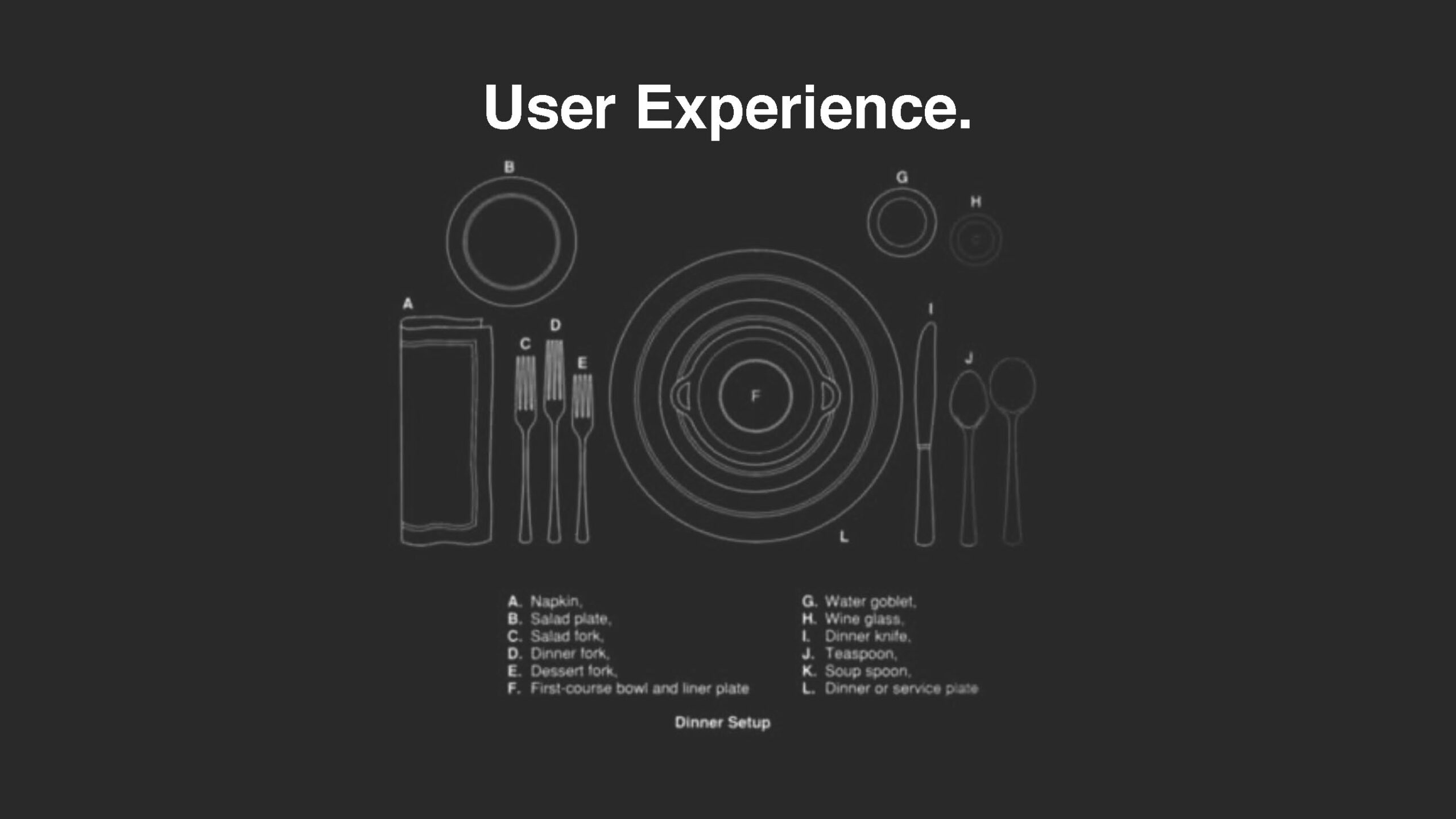
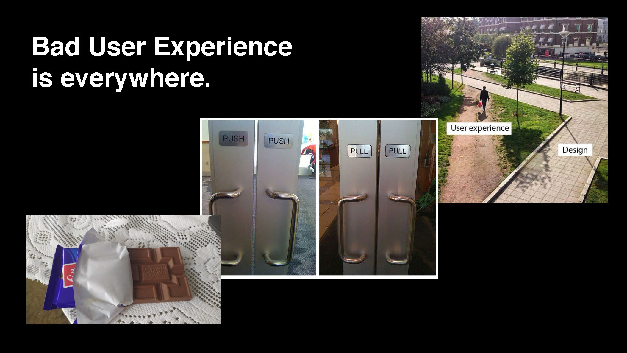
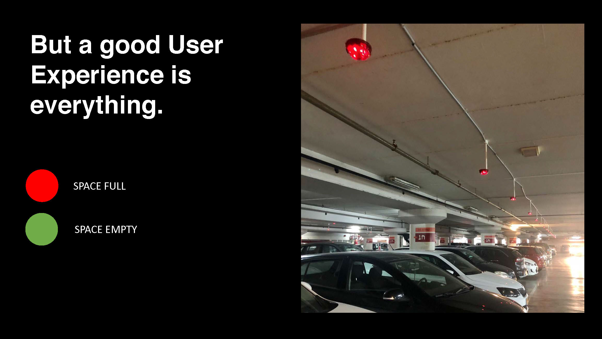
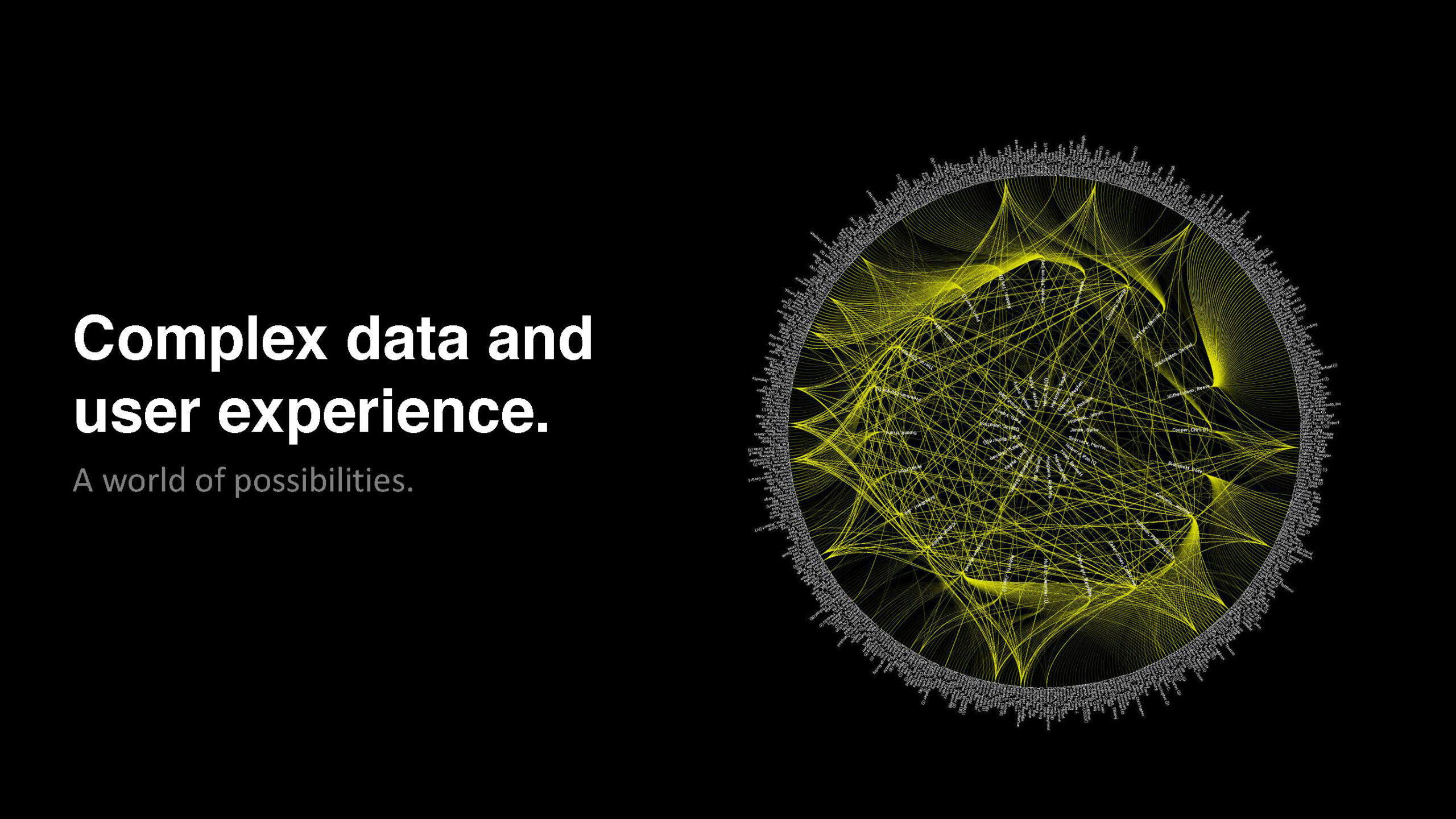
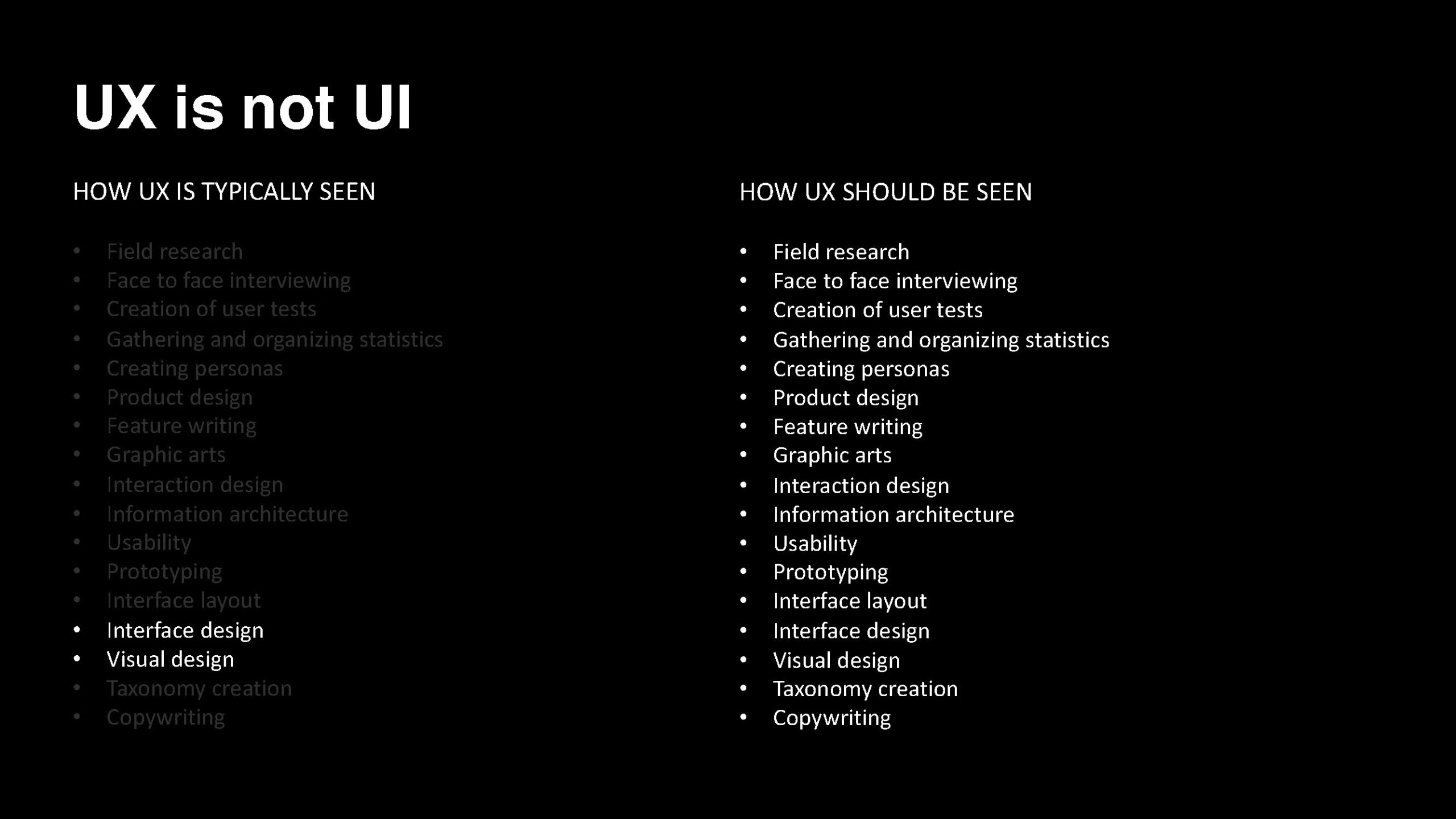
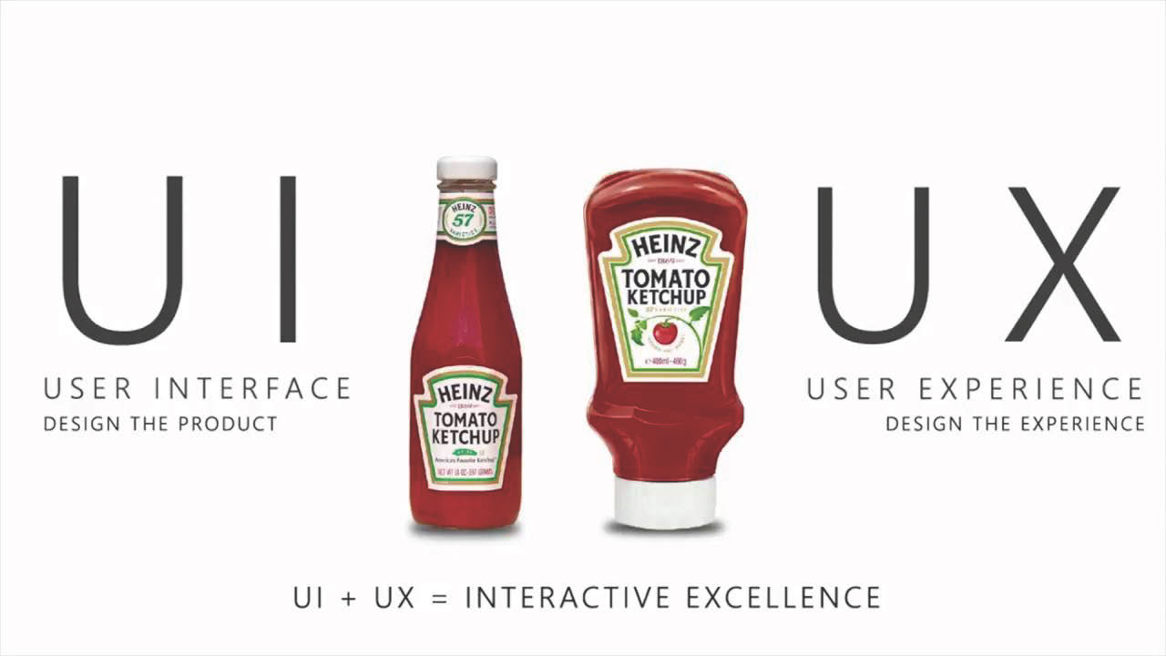
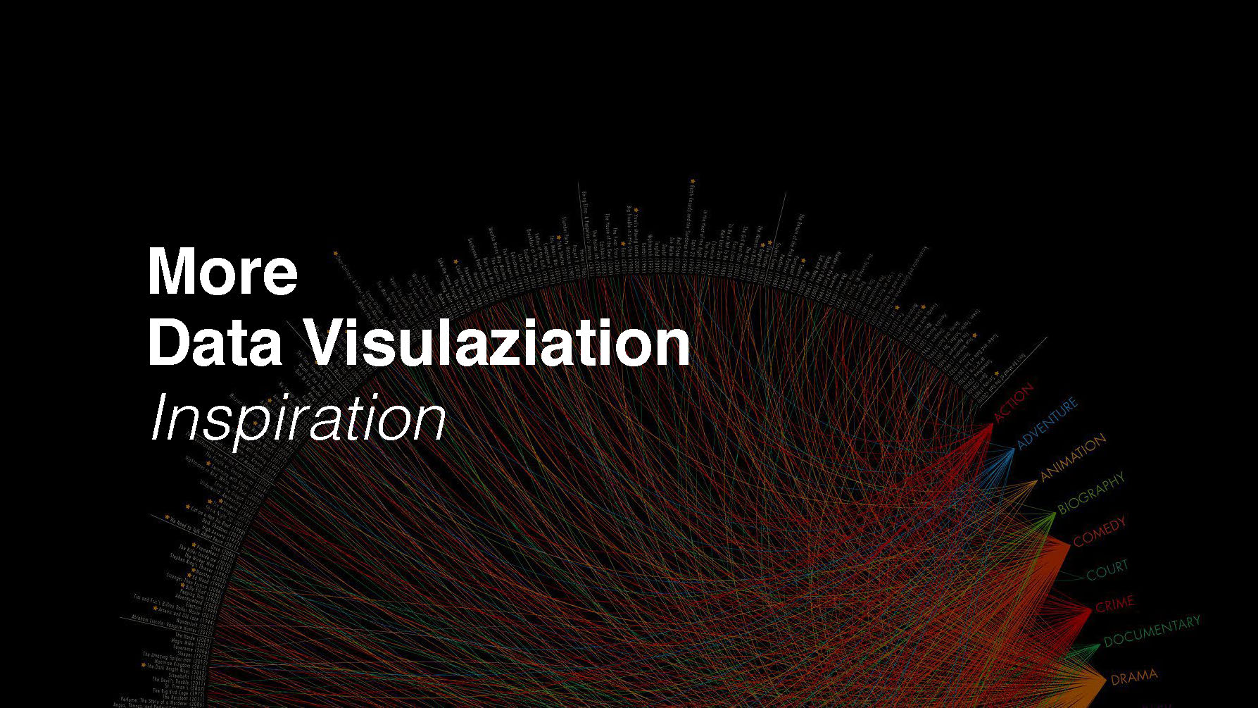
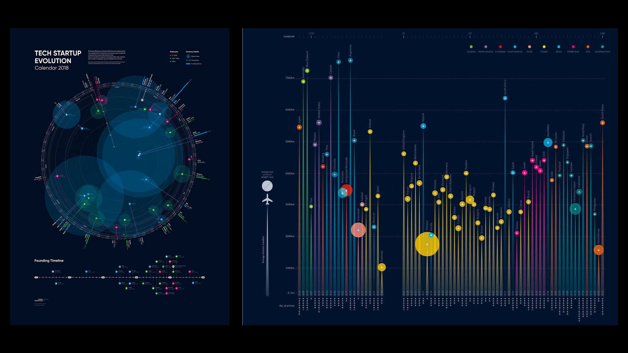
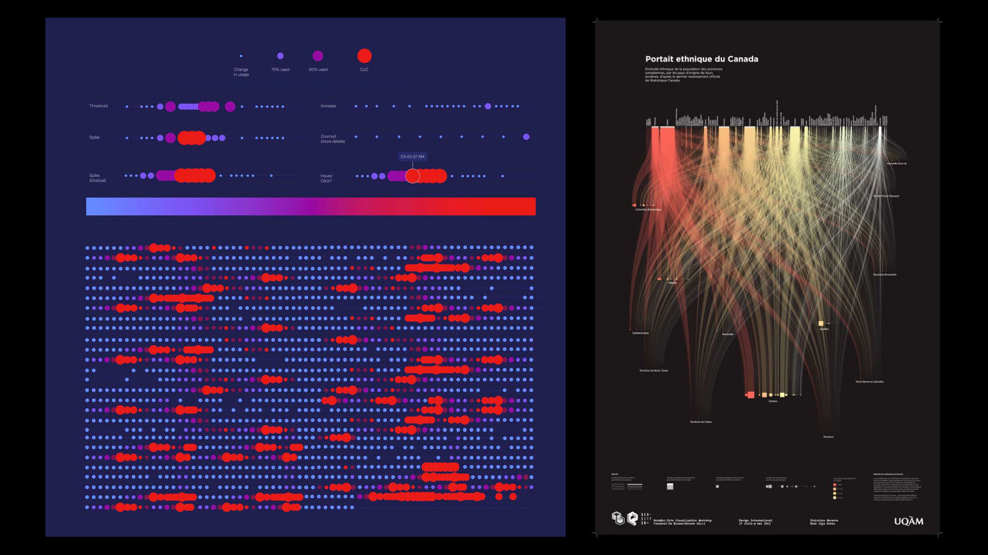
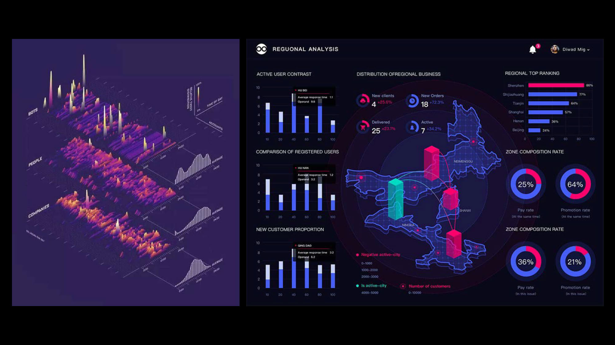
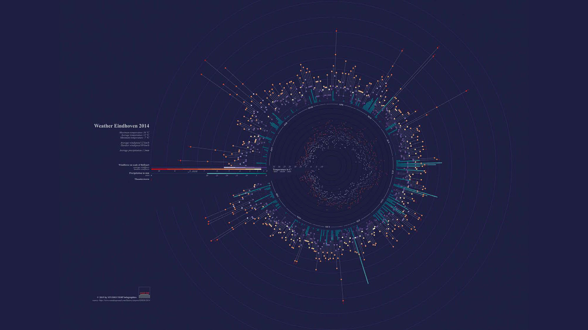
I crafted a keynote presentation for the broader team to introduce the fundamental concepts of User Experience (UX), its tangible benefits, and to establish a connection between UX and Data Visualization, as this would be central to the upcoming project I was set to lead. This presentation was instrumental in priming the minds of the users and team members I would be working with.
The goal was to help them see that my role was to enhance their efficiency and increase the business value they delivered. Achieving this required their commitment, as integrating Design as a discipline into their work culture would need time. This period marked a time of transformation, and although change can be uncomfortable and sometimes painful, it is essential for growth.
This is particularly true in traditional, non-design-led companies accustomed to long-established ways of working. Overall, my role transcended design; I had to swiftly adapt and play a strategic, political role to successfully maneuver through a highly complex environment.
THE DESIGN PROCESS
The Design Process Approach, In a Nutshell.
After presenting and answering questions, the team felt confident and eager to commence the project.
My strategy began with a Discovery phase, putting UCD intro practice I aimed at thoroughly understanding the users, the challenges at hand, their pain points and their expectations for the new platform. This phase also included multiple discussions with the tech team to decide on the technologies we would employ and understand their implications on deliverables and timelines. Being the sole designer, I had to be very smart about how I managed my time, making strategic decisions about which steps to streamline or skip to maintain momentum.
Given the application’s complexity and the constrained timeline, we adopted an MVP (Minimum Viable Product) approach. This strategy allowed us to quickly learn and reduce risks by introducing new work methodologies to the team in manageable increments.
By the end of the Discovery phase, we had a solid understanding of what to focus on for our first MVP and the expected outcomes. We also maintained a prioritized list of high-level ideas, ready to be developed as soon as we could expand our team.
I developed and shared a service blueprint that outlined core user journeys, high-level wireframe concepts, and several prototype iterations. This blueprint was crucial in setting the stage for the following phases of the project.
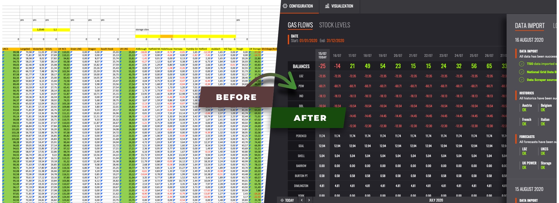
Overcoming Legacy Challenges: Transitioning from Clunky Spreadsheets to Streamlined Operations
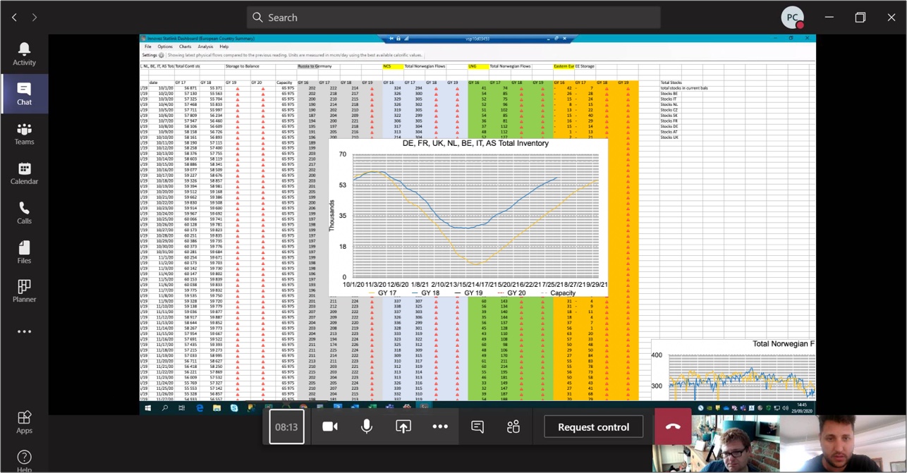
Before my involvement in the project, the existing Gas Balance Builder solution at EDF Trading was a clunky spreadsheet system that posed several challenges and risks for its users.
This outdated approach required extensive manual input, which not only slowed down processes but also increased the likelihood of errors and data corruption.
The spreadsheet's limited functionality hindered real-time data analysis and made it difficult for users to collaborate effectively.
Additionally, the system’s inability to handle concurrent accesses led to bottlenecks, further complicating the workflow. These pain points significantly impeded productivity and made the system a risky foundation for making critical business decisions.
User Research and Personas
The user research unfolded in several phases:
• Preparation of Survey and Interview Questions: Crafting targeted questions to extract meaningful insights.
• Interview Recruitment with Key Users: Engaging key users for in-depth discussions.
• Ethnographic Studies: This immersive technique involved observing users in their natural environments to understand how they interacted with the existing solution.
• Team Workshop: These sessions aimed to synthesize ongoing discussions and prioritize next steps based on findings.
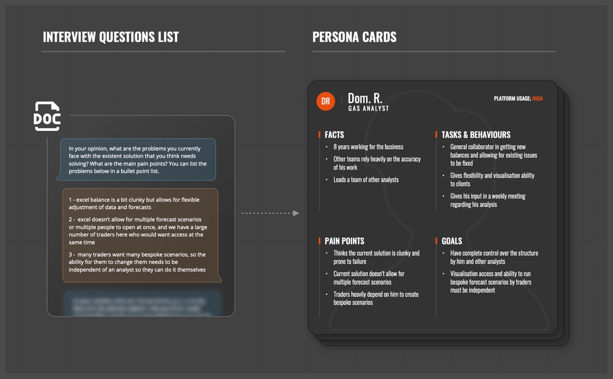
Initially, my goal was to delve into users' concerns with the current system. I designed interview questions and distributed them to key users to capture their pain points and concerns comprehensively. Allowing them to respond in their own time proved most effective while I familiarized myself with the current application-a data heavy Excel Application.
These steps provided a solid understanding of our core users. Given the application’s significance, it was destined for use across major company sectors. The primary users identified were:
This approach ensured that the design and development were informed by thorough, user-centred research, aligning the final product closely with the needs of its primary users.
REMOTE WORKSHOP
After establishing each persona, I used MIRO to conduct remote ideation workshops with the team. These sessions were designed to brainstorm new ideas, refine existing ones, and address pain points identified during the research phase. Recognizing it was the first remote session for most team members, I prepared a guide detailing what to expect and how the session would be conducted to help participants prepare and engage effectively.
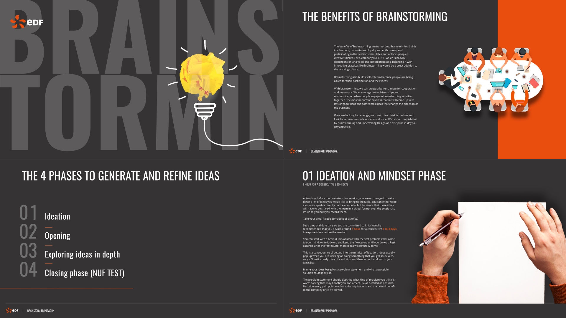
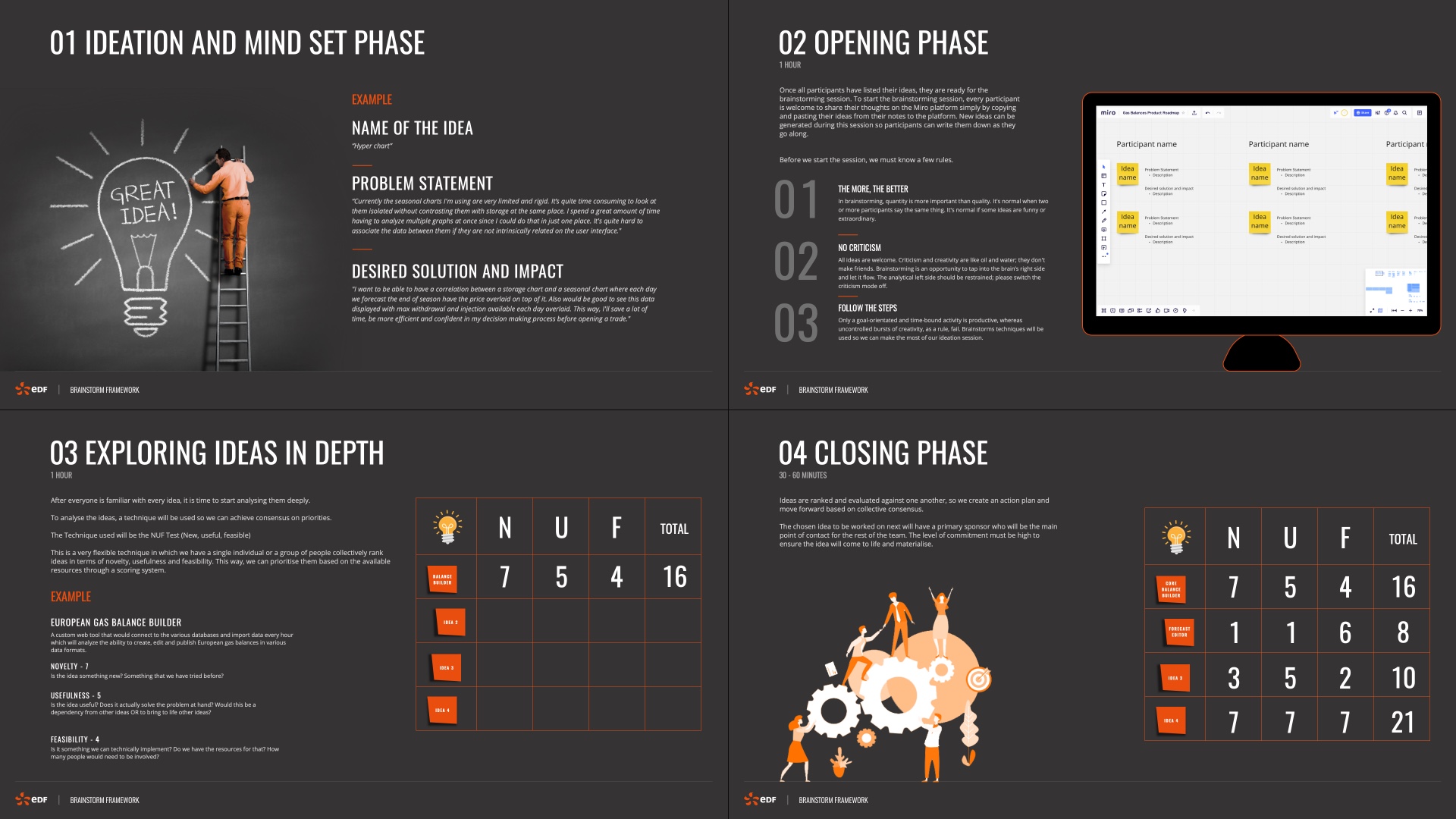
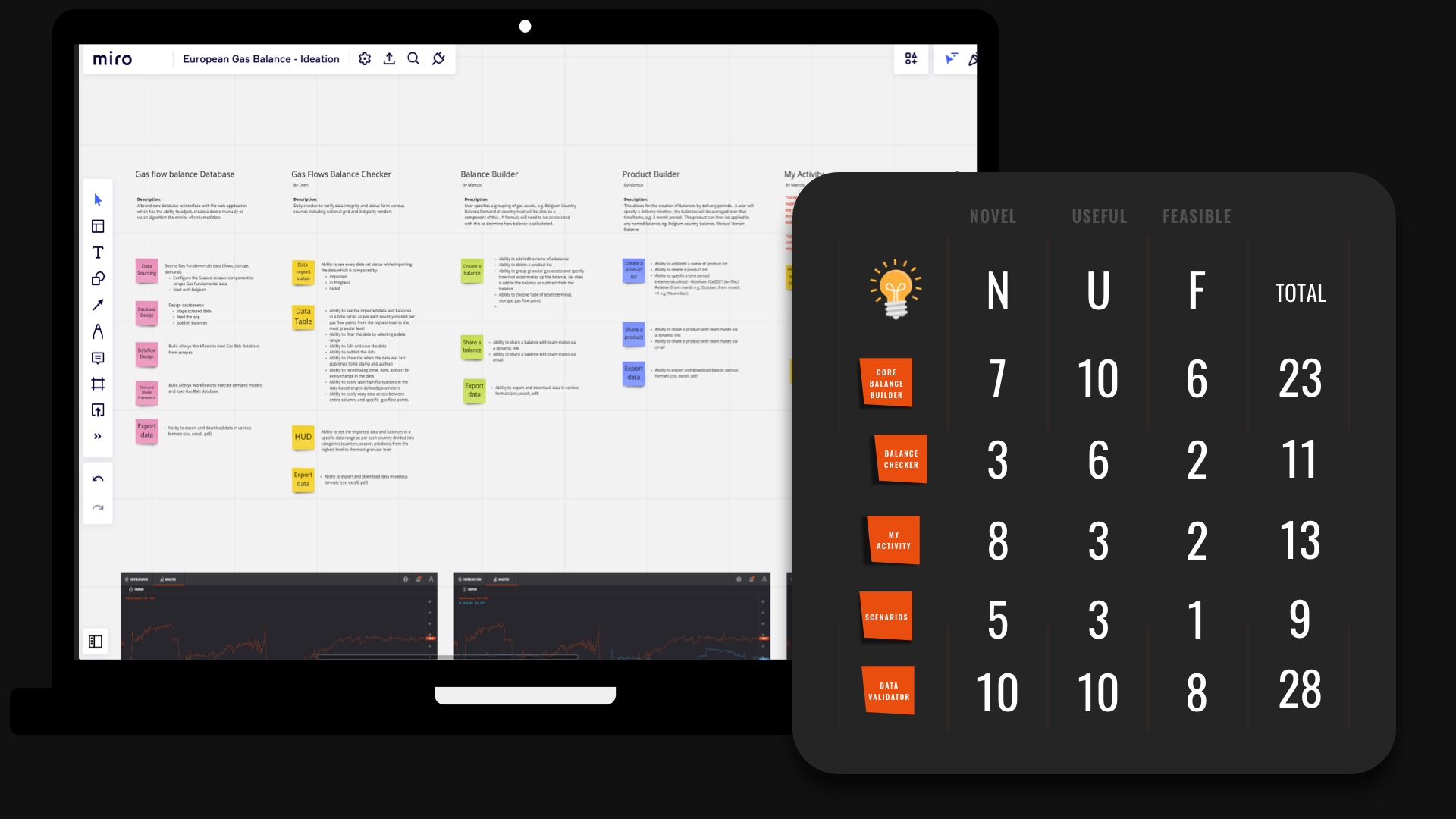
During the final part of the session, I employed the NUF test to score, evaluate and prioritize features for our initial Minimum Viable Product (MVP), considering our available resources.
Together with the Product Owner, we mapped out our next steps based on the consensus from these workshops. This process clarified the project direction and boosted team confidence, paving the way for us to proceed to the subsequent phases.
Mapping out user journeys and flows
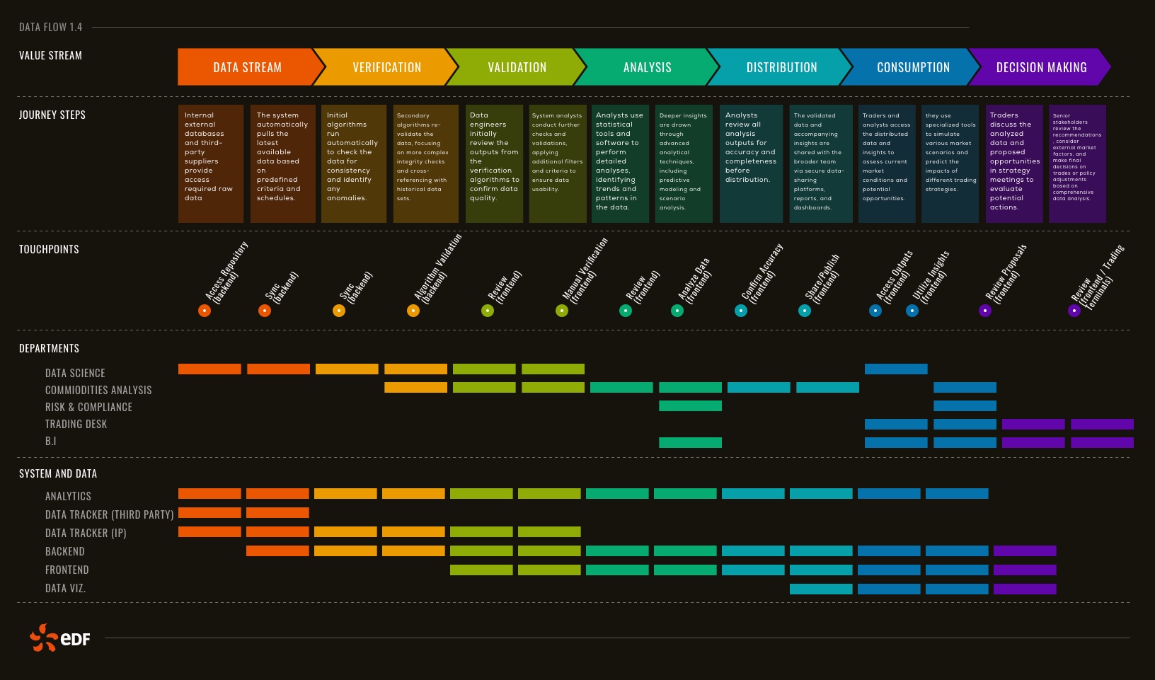
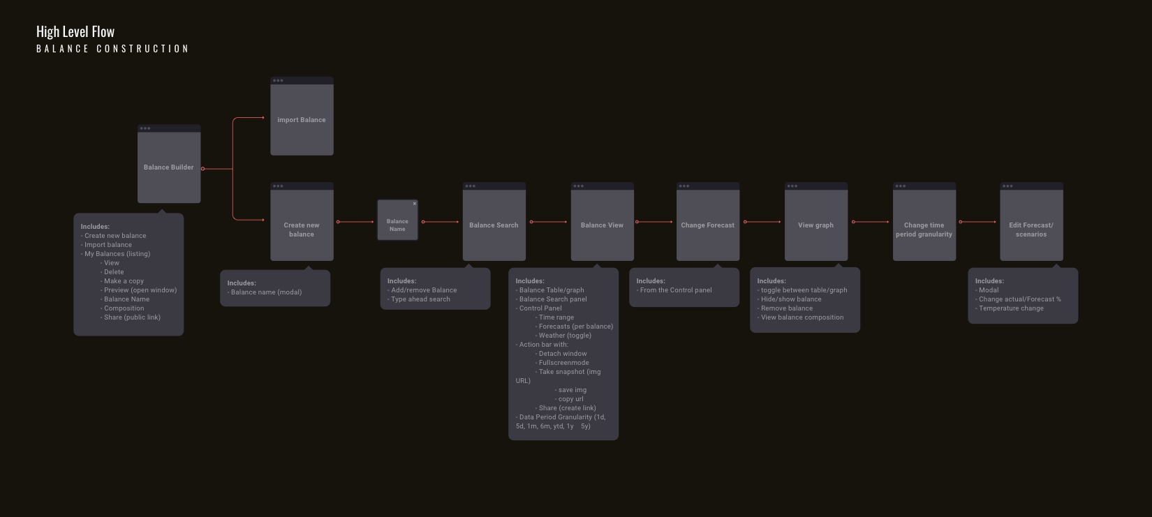
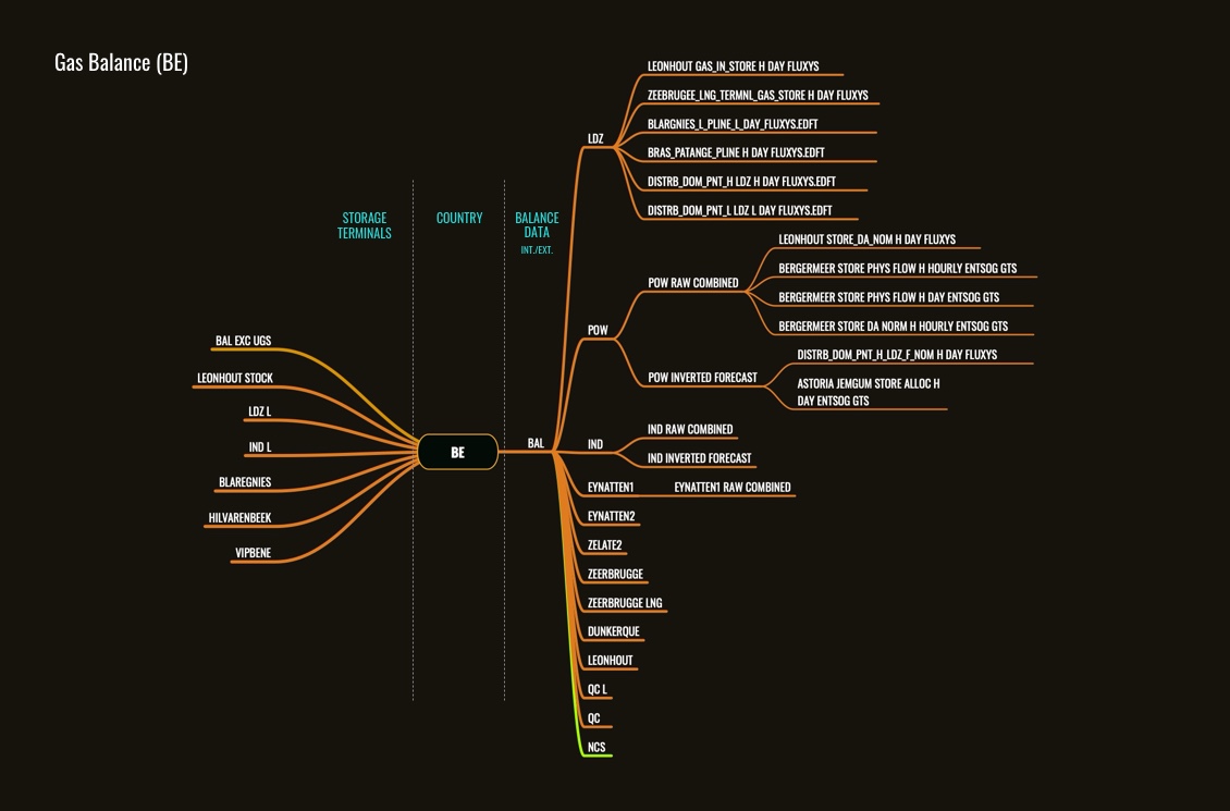
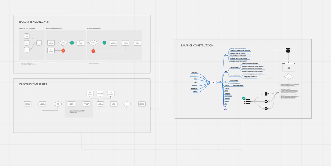
After agreeing on priorities and I refined and detailed each user touchpoint, from the initial log-in to navigating through the interface and engaging with various functionalities. At this stage, my approach involved creating high-level user flows to visualize each step users take within the dashboard, from start to finish.
These visual maps are crucial for pinpointing the user's journey and identifying any potential friction points, ensuring the interface design is intuitive and aligned with user needs. By crafting these user flows, I could strategically design interactions that facilitate not just the completion of tasks but also the meaningful interpretation of data that directly supported their decision-making processes.
Here is a sample of touchpoints and high-level flows which ensured the product design was ready to move on to the next phases.
Wireframes and Prototyping
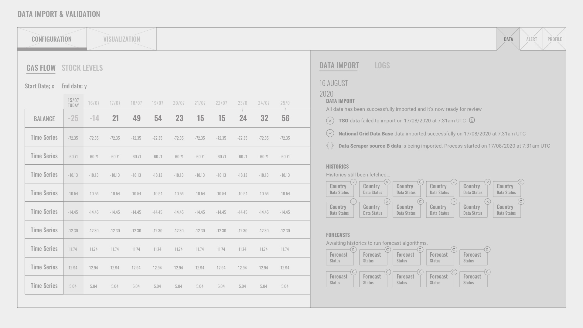
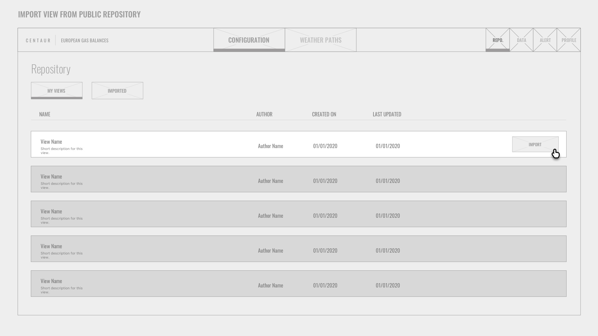
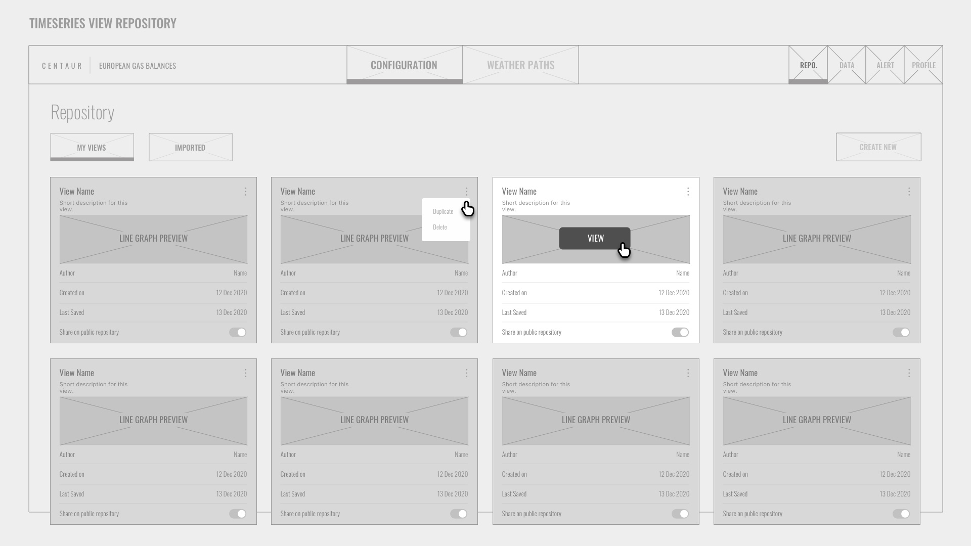
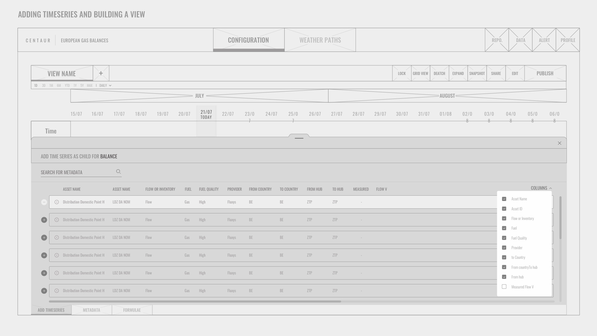
I assisted the Product Owner in writing user stories and created multiple wireframes using Sketch. To expedite feedback collection and accommodate tight timelines, I quickly developed click-through prototypes in InVision, enabling rapid iterations and swift improvements.
Setting KPIs, Metrics and Results
User testing sessions for the redesigned Gas Balances Dashboard were structured to evaluate its usability and effectiveness, aligning closely with specific user needs and overarching business objectives.
The sessions focused on several key performance indicators (KPIs) to quantitatively and qualitatively assess performance across multiple dimensions.
TESTING THINGS OUT
Key Performance Indicators (KPIs):
1. User Engagement: Measure the frequency and duration of user interactions with the platform.
2. Task Completion Rate: The percentage of tasks completed successfully by users without assistance.
3. Error Rate: The frequency of errors users encounter while using the platform.
4. User Satisfaction: User satisfaction level measured through post-session survey scores.
5. Conversion Rate: For applicable tasks, the percentage of actions leading to a desired outcome.
Metrics:
1. Engagement Metrics: Number of logins per day, average session duration, and page views per session.
2. Completion Metrics: Percentage of tasks completed as tracked through the platform.
3. Error Metrics: Number and type of user-reported issues, plus system-detected errors.
4. Satisfaction Metrics: Scores from a standardized user satisfaction survey administered post-testing.
5. Conversion Metrics: Conversion rates observed for key actions intended.
VISUAL DESIGN
Visual design and further development
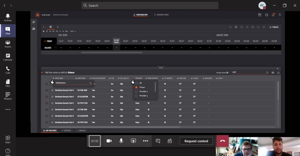
After numerous iterations, I moved on and finalized a design style that resonated well with the audience.
By treating each MVP feature as a distinct project, I could swiftly validate each design with the team.
I collaborated closely with highly experienced front-end developers, allowing us to prototype features in a manner very close to the final web application. Given the complexity of the web app, we chose to use AngularJS for the front-end development.
Streamlining Data Integrity: Enhancing Forecast Accuracy and Efficiency by 70%
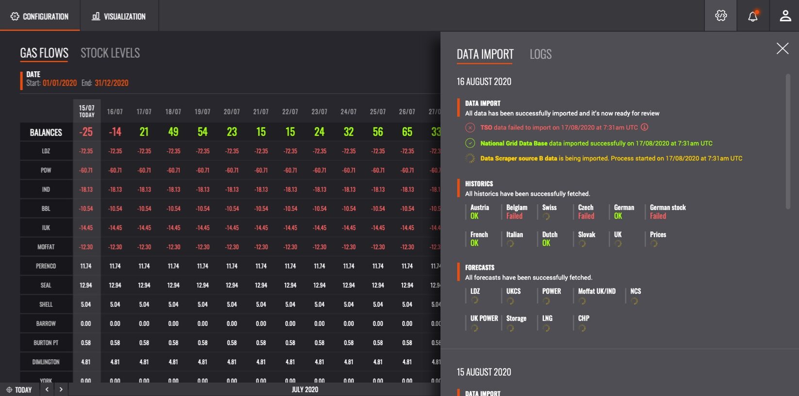
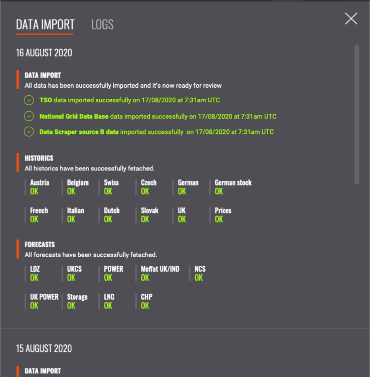
Every morning, data engineers and commodities data analysts conducted verification checks on streamed data to ensure its integrity before releasing it to a wider audience. I designed a solution that displayed these processes in real time, accessible from the global navigation. This allowed analysts to easily monitor the status of each data source by country before forecasts were automatically run—tasks that were previously performed manually. This enhancement alone boosted the average output time by 70%, significantly increasing team productivity.
Optimizing Data into Actionable Insights
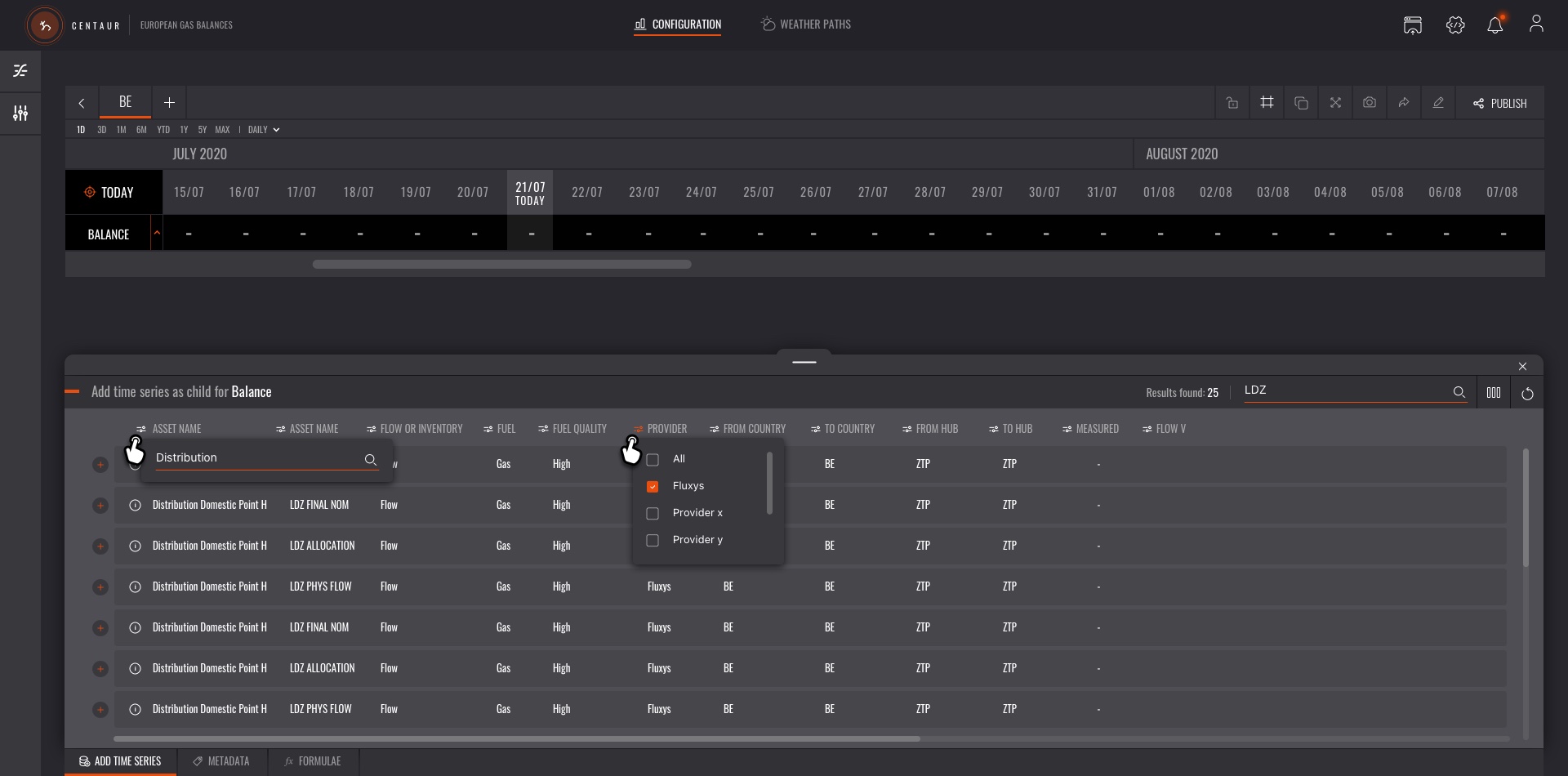
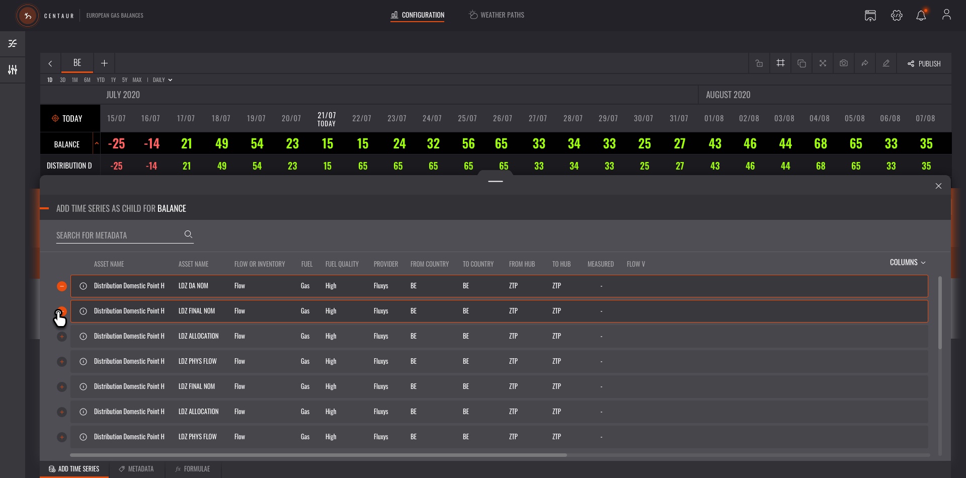
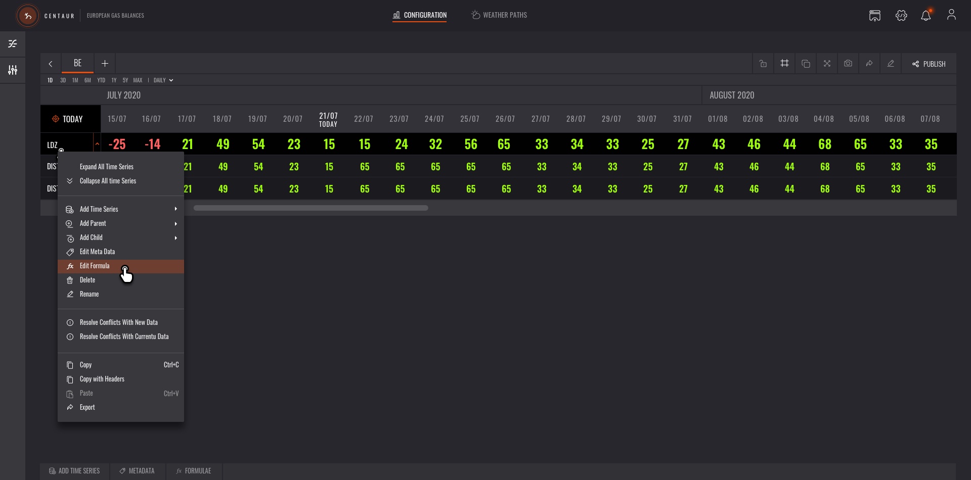
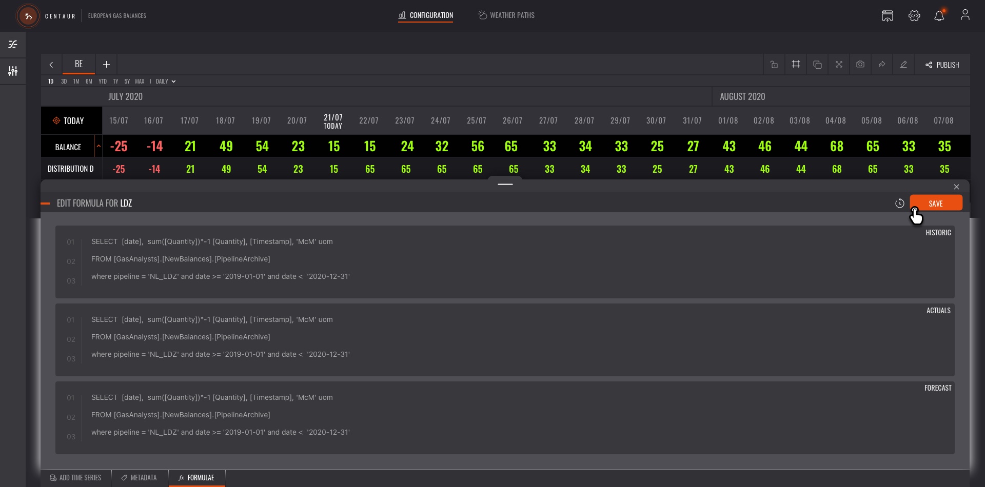
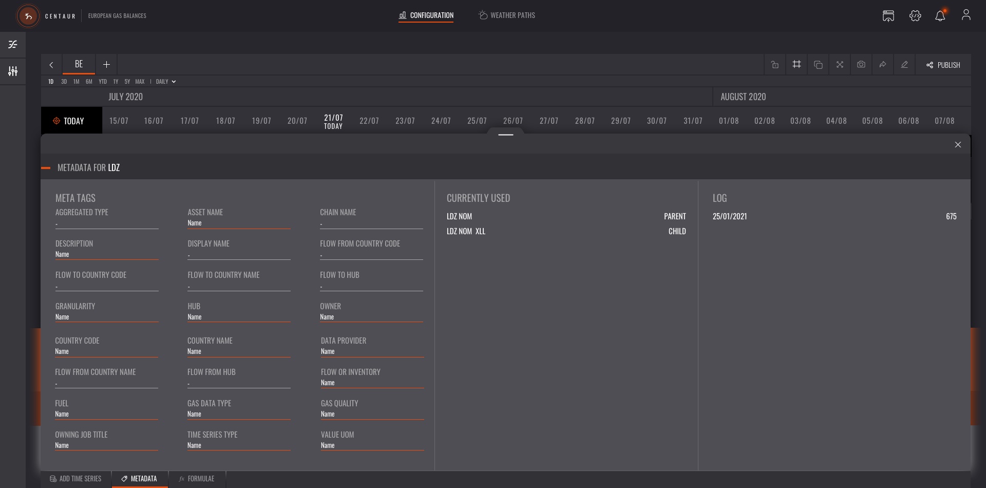
As the MVP matured and the foundational elements functioned as anticipated, I developed the central feature, the Gas Balance Builder. Each "balance view" consists of streamed data that forms time series. These chronological time series values result from various algorithmic processes operating in the background, incorporating elements like historical data and forecasts.
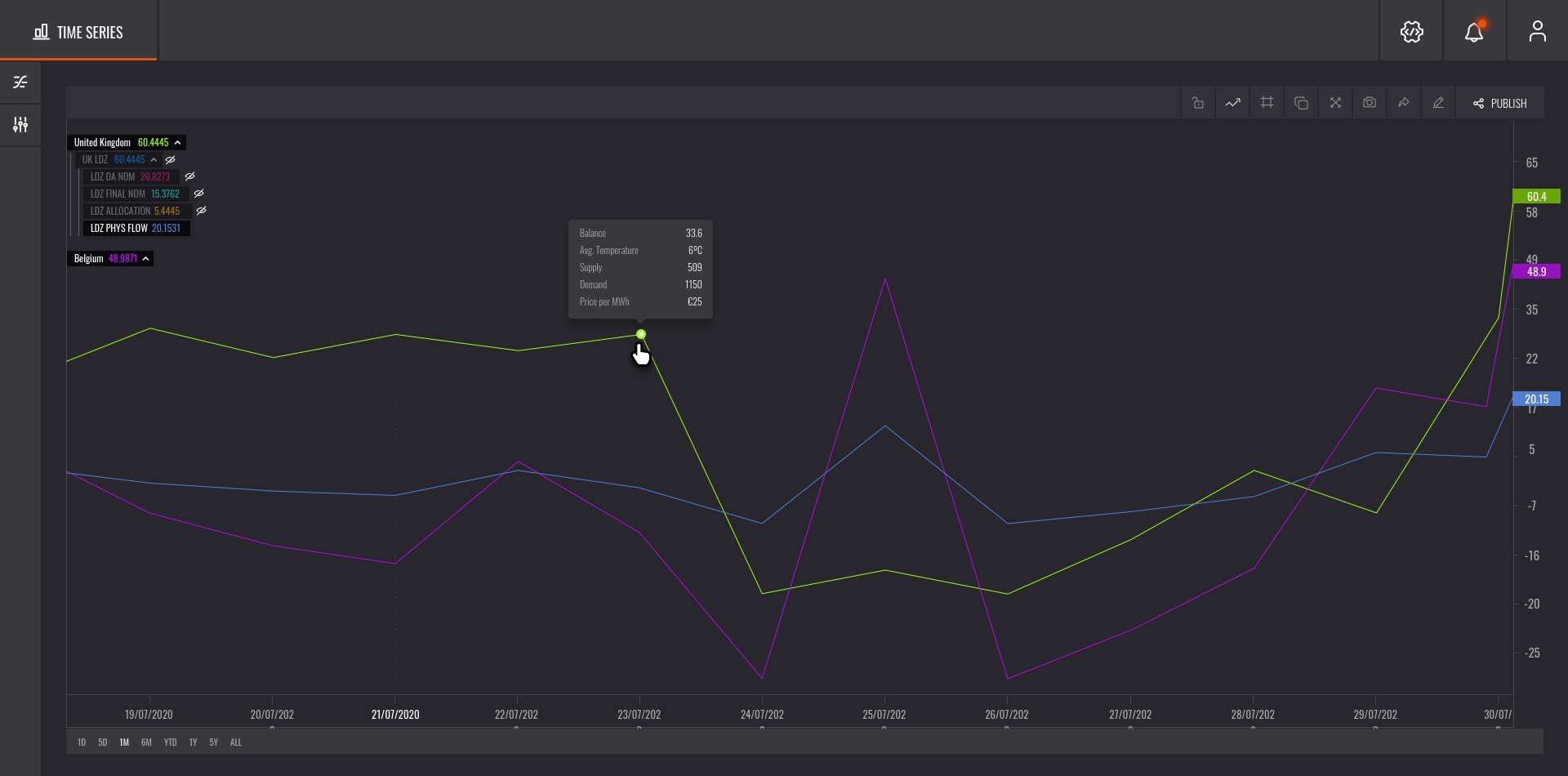
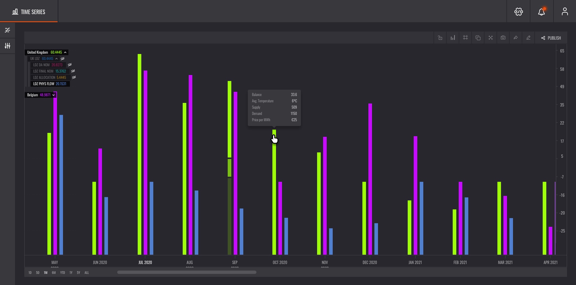
Integrating Data Visualization
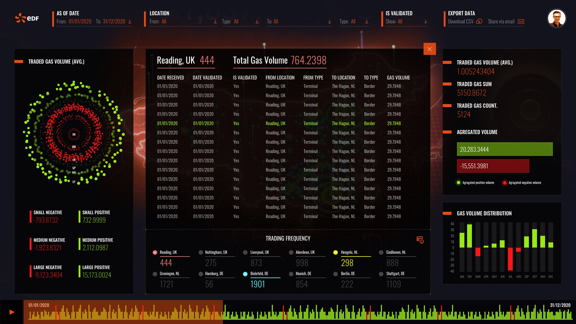
Gas Commodity Traders utilized the data through various visual outputs, which significantly influenced their decision-making processes—a key factor in the company's revenue generation. Prior to implementing my solution, traders relied on external tools for analysis, a practice that was both time-consuming and inefficient. By integrating all functionalities into a single platform, I designed features that enabled real-time collaboration, allowing traders to communicate effectively with other business areas. This integration dramatically improved the speed of communication by 84%, underscoring the substantial time and cost savings that can be achieved when User Experience (UX) is thoughtfully applied. This not only streamlined operations but also enhanced strategic decision-making across the company.
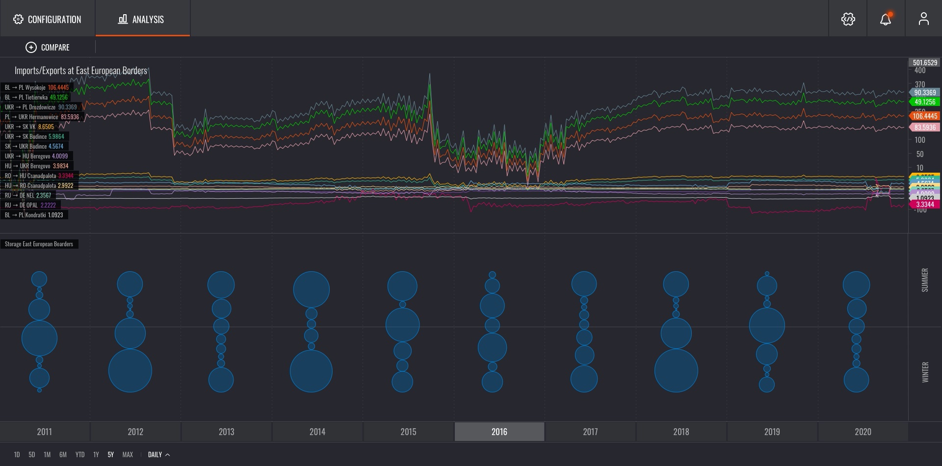
Gaining Real-Time Market Insights with Innovative Data Visualization
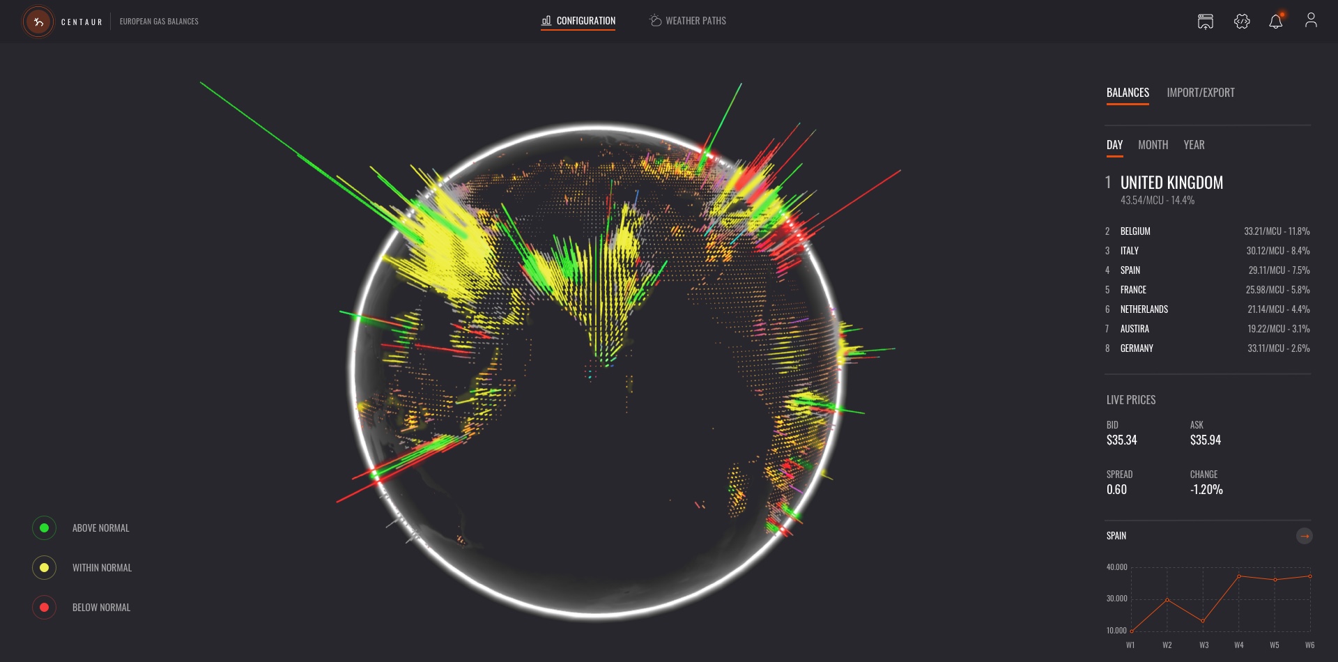
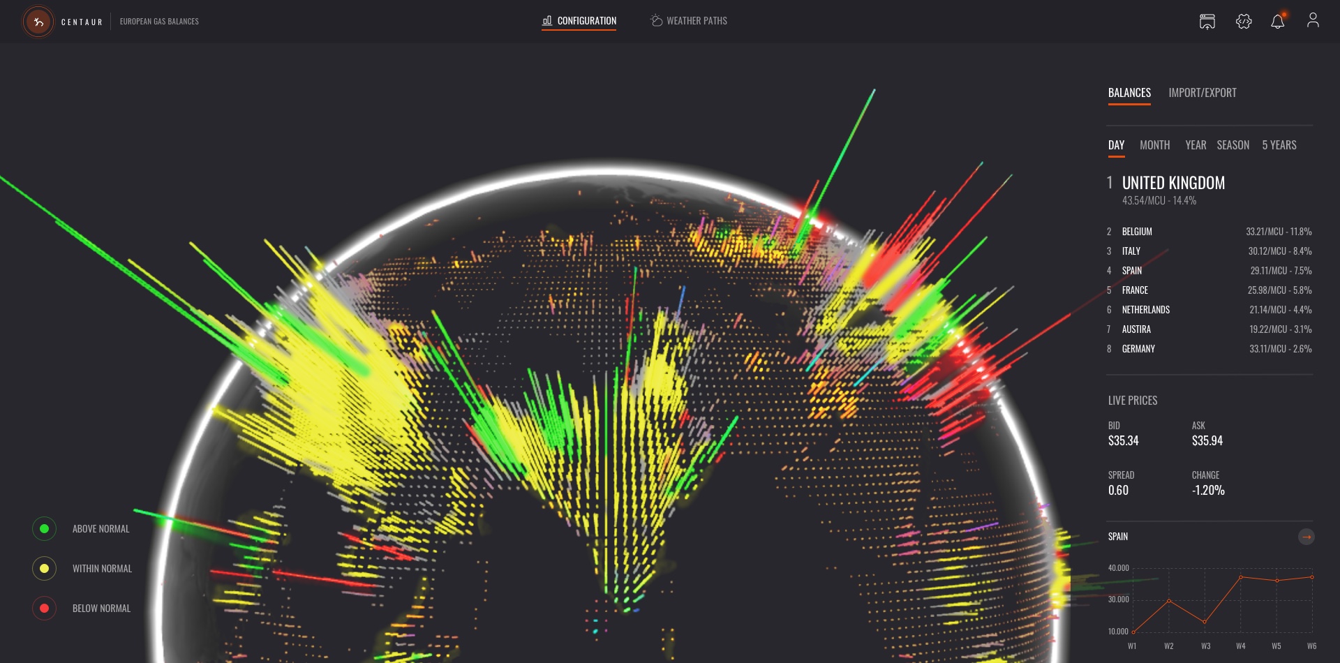
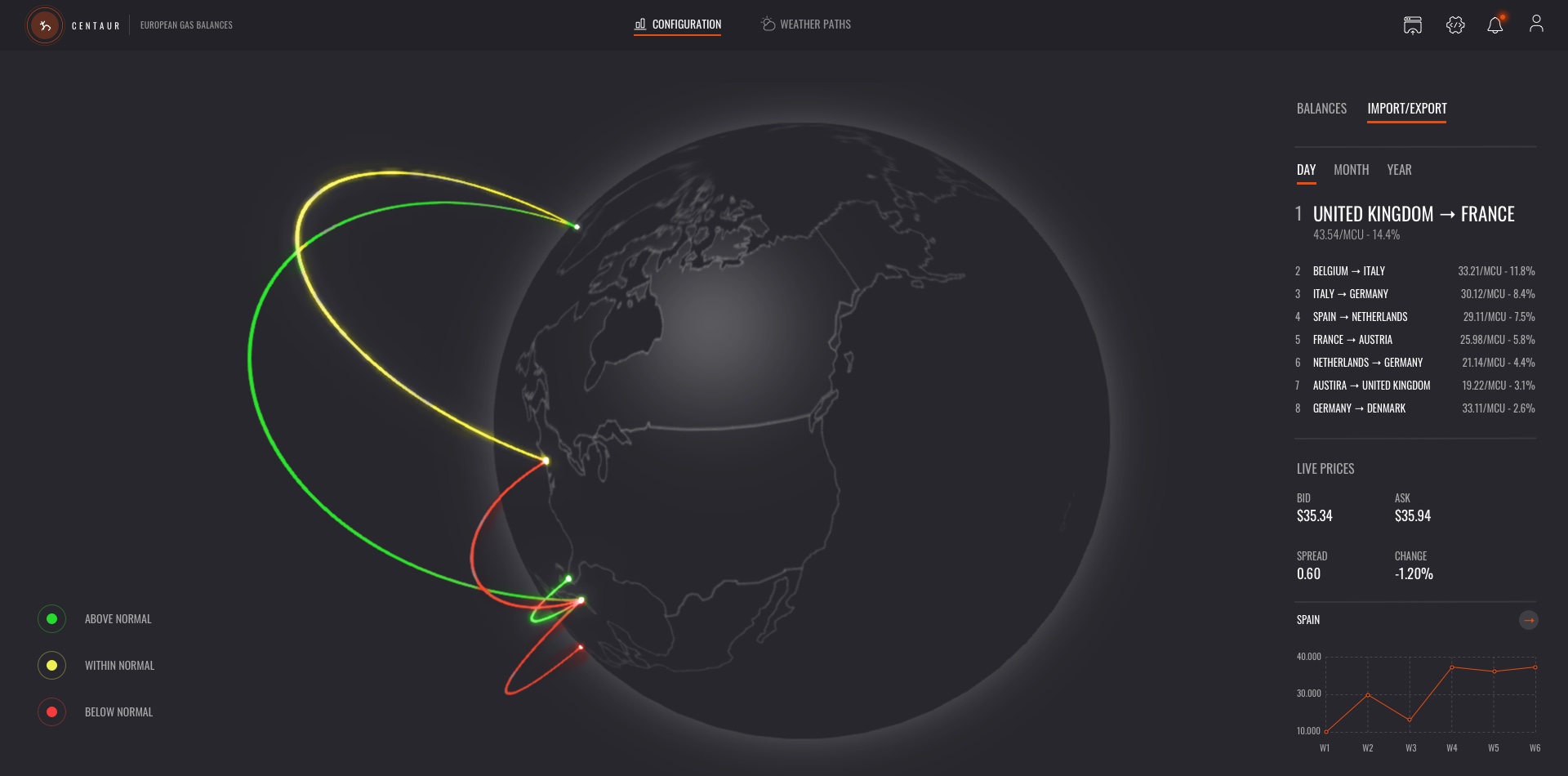
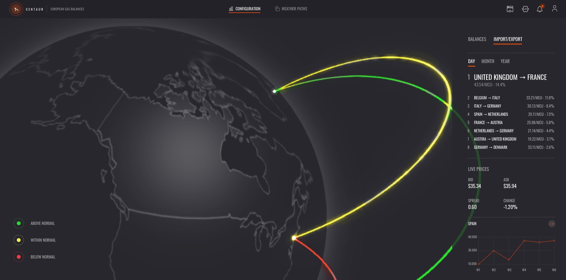
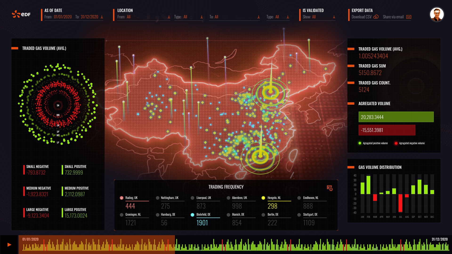
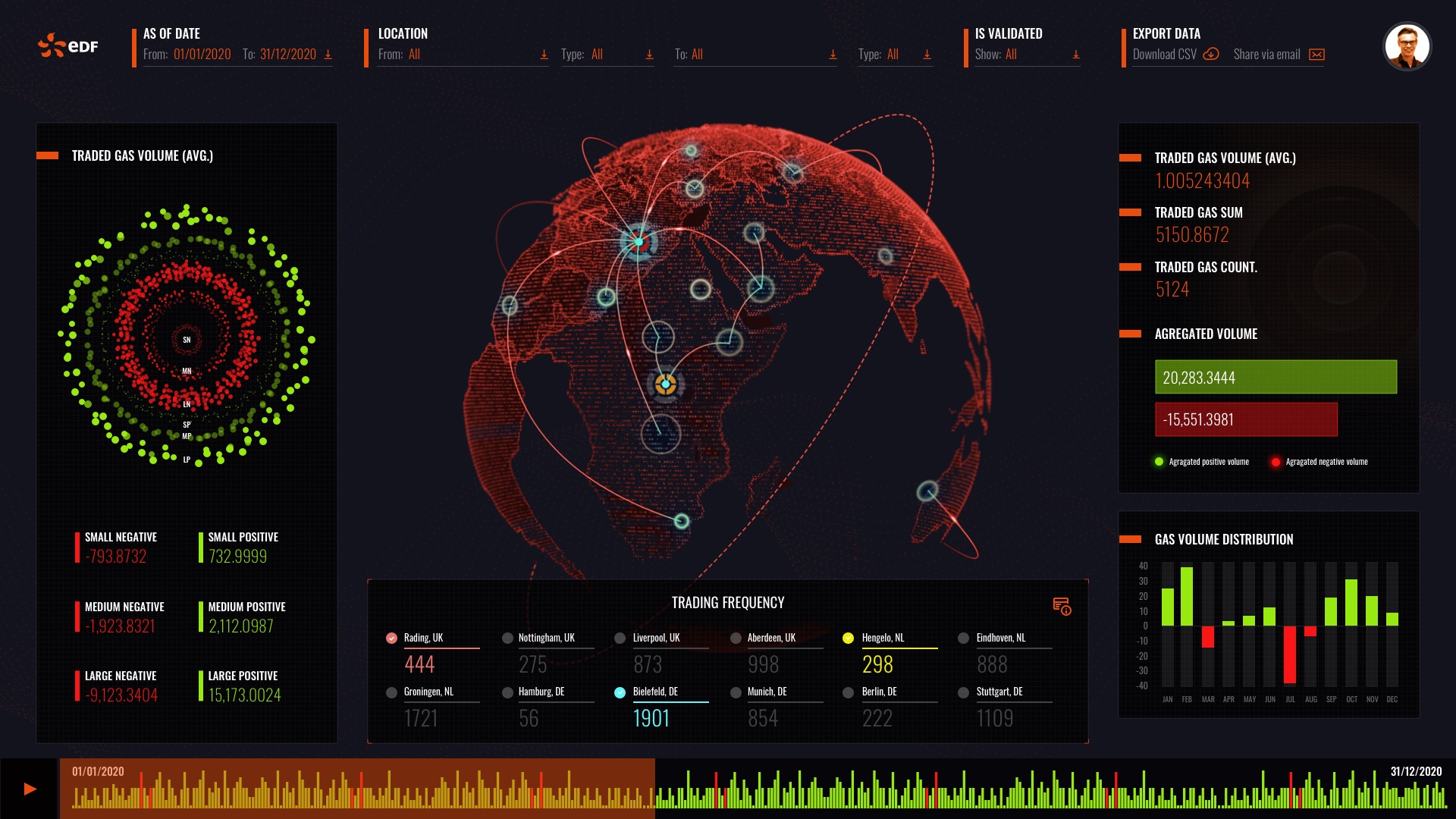
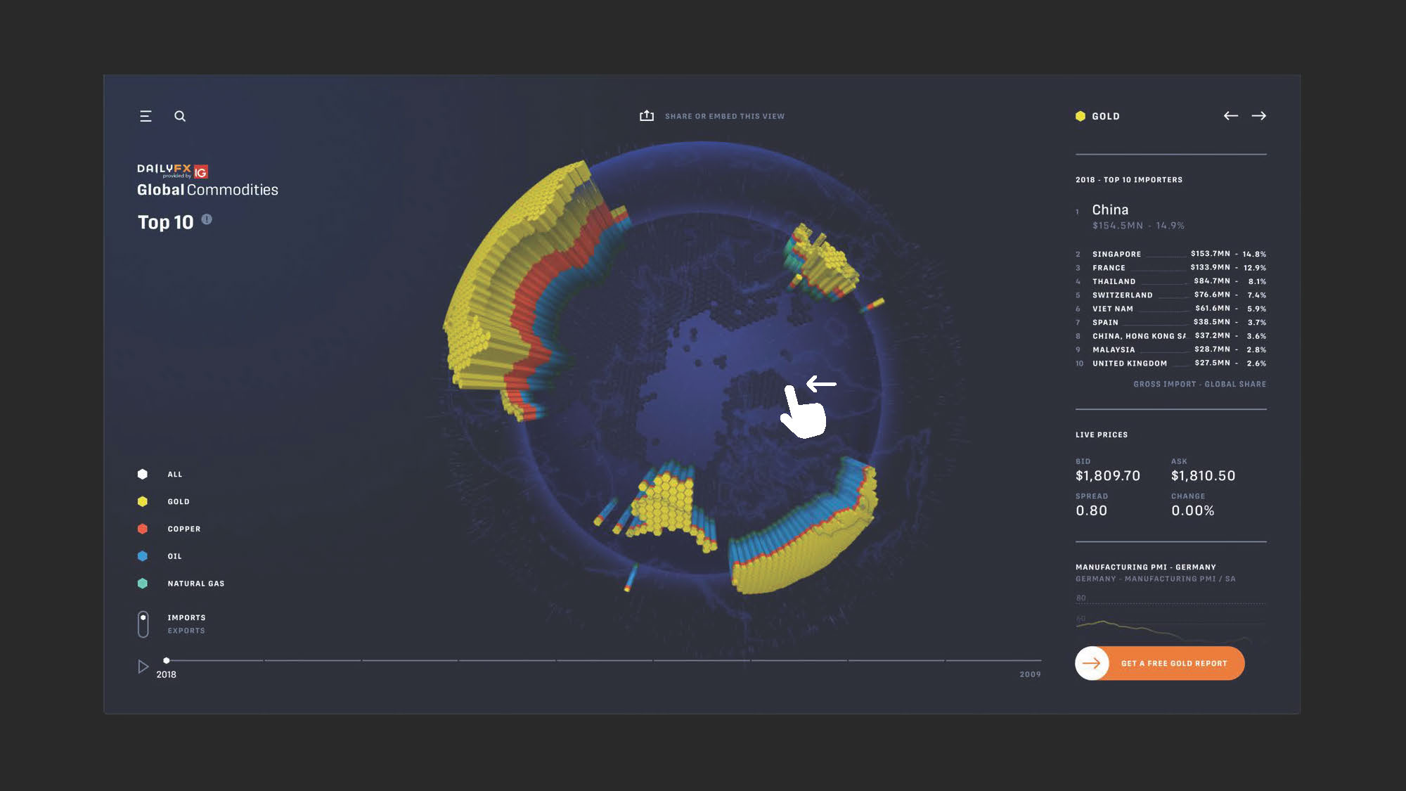
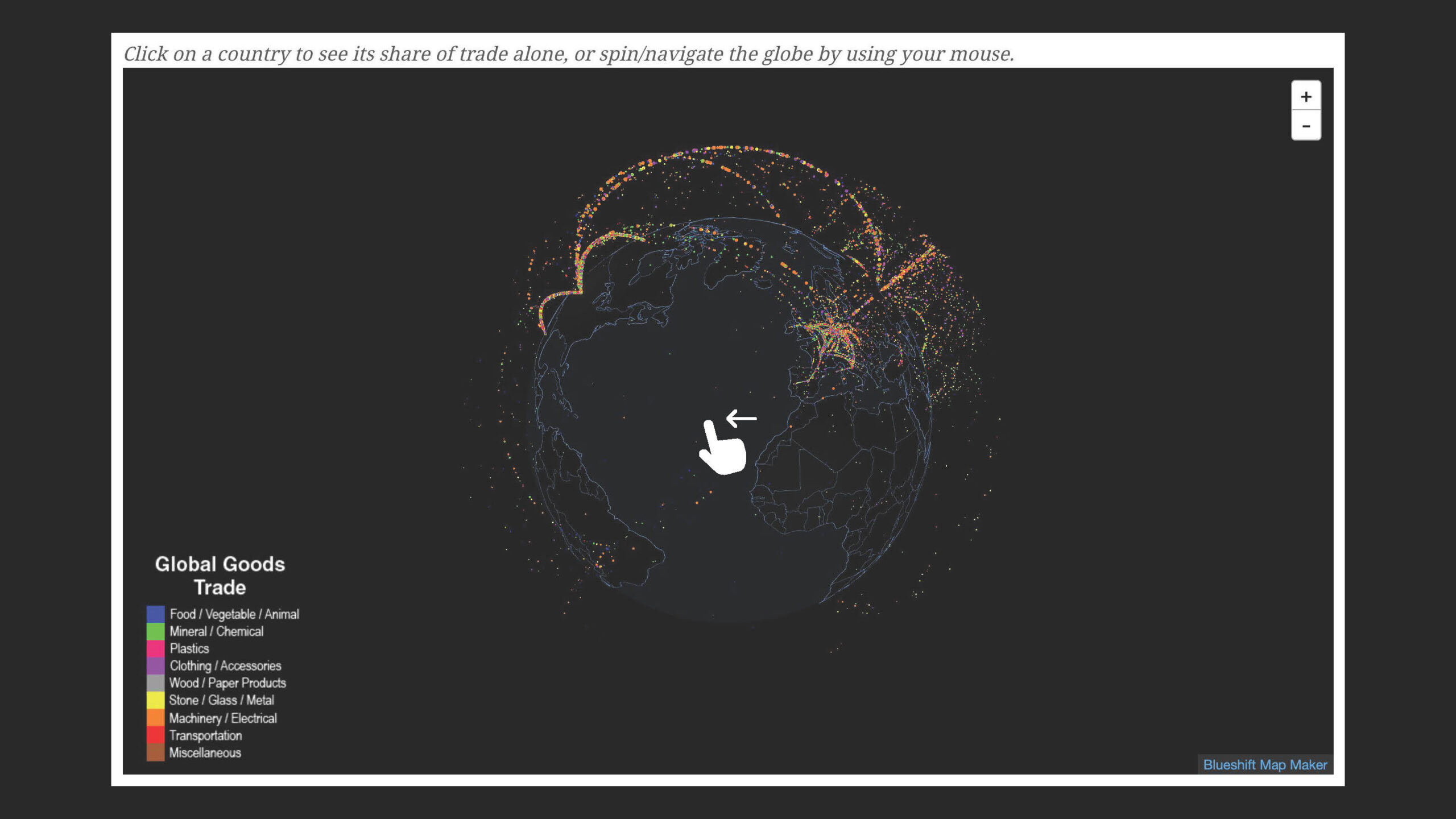
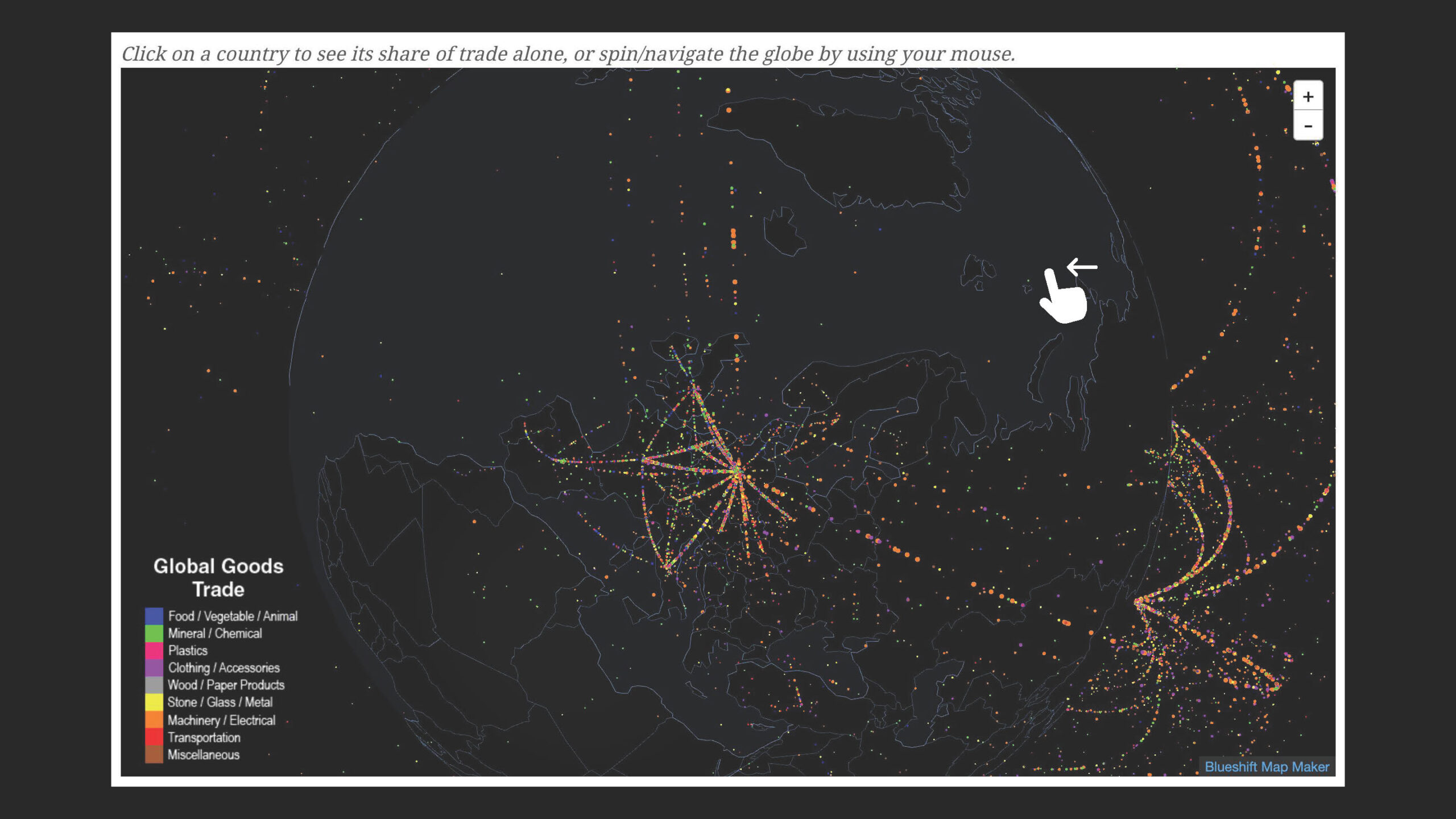
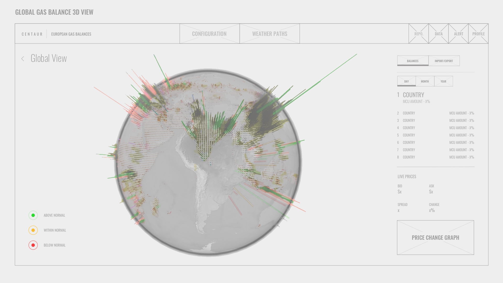
Lastly, I designed a comprehensive Dashboard that enhances traders' ability to visualize import and export rates using an innovative 3D globe at a glance. This dynamic visualization tool not only allows traders to quickly identify gaps in the market but also to pinpoint emerging opportunities with greater accuracy. By integrating geographical data representation, traders gain a spatial understanding of trade flows, enhancing their strategic decision-making capabilities. This intuitive interface simplifies complex data analysis, making it easier for traders to respond to market changes effectively and capitalize on potential advantages.
Final MVP Testing
Objective: To confirm that all identified issues were addressed and that the product met all user requirements before launch.
Method: A/B testing between old and new versions to quantitatively measure performance improvements and user satisfaction.
Results: Significant improvements in user satisfaction and engagement metrics. Error rates decreased by 40%, and user satisfaction scores increased from an average of 6.5 to 8.7 out of 10.
STYLE GUIDE
UI style guide
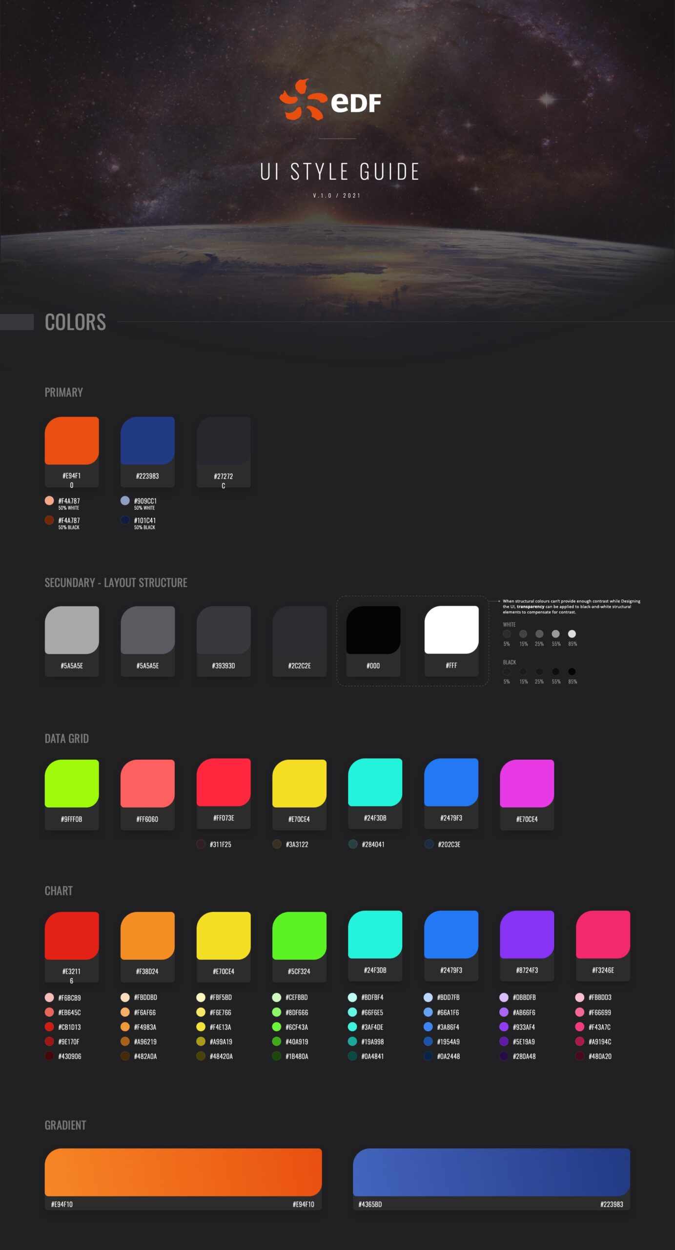
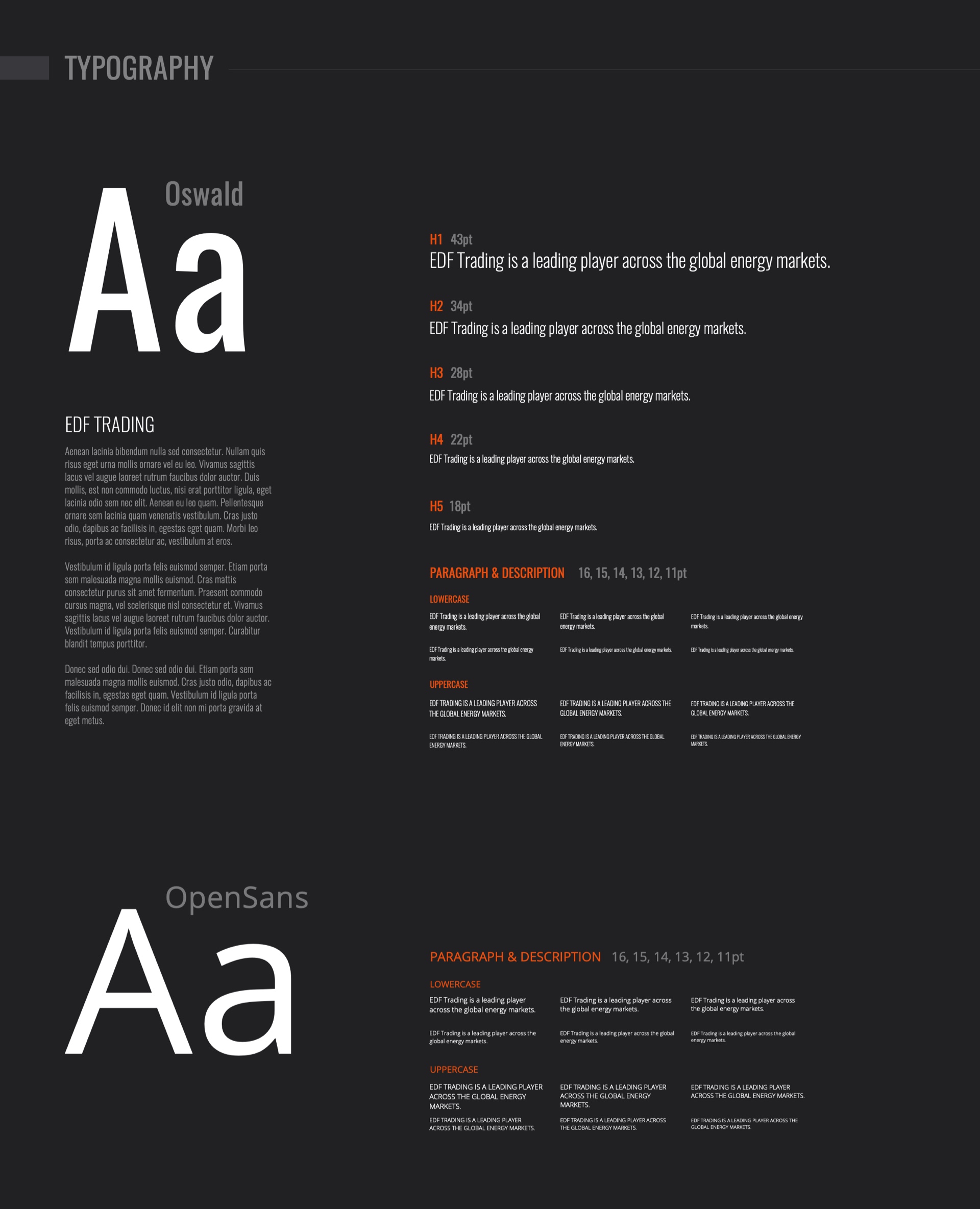
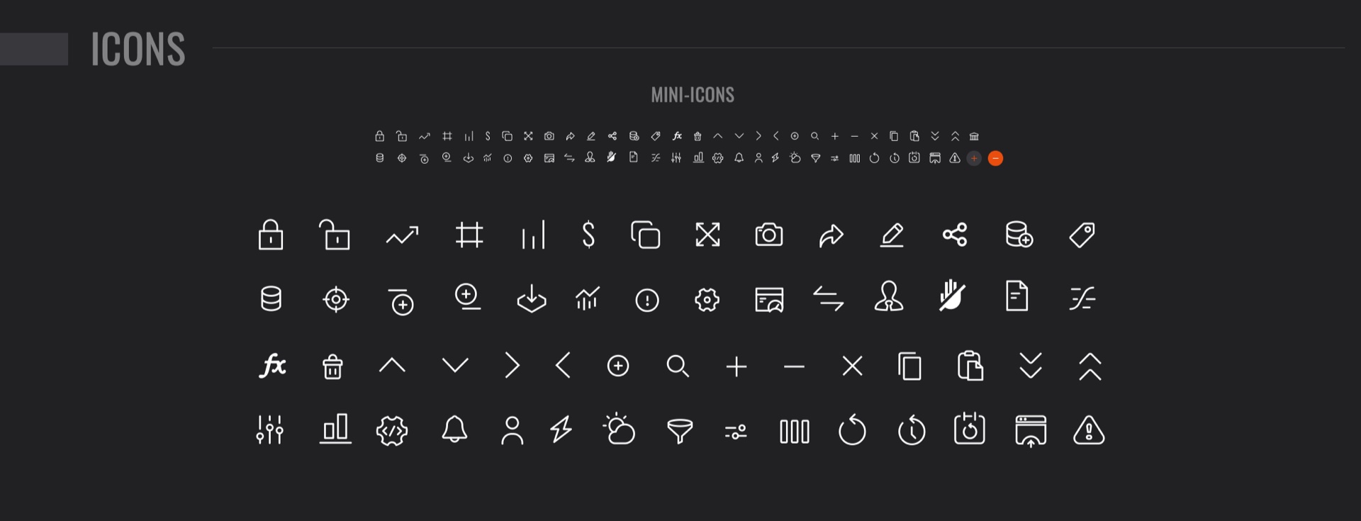
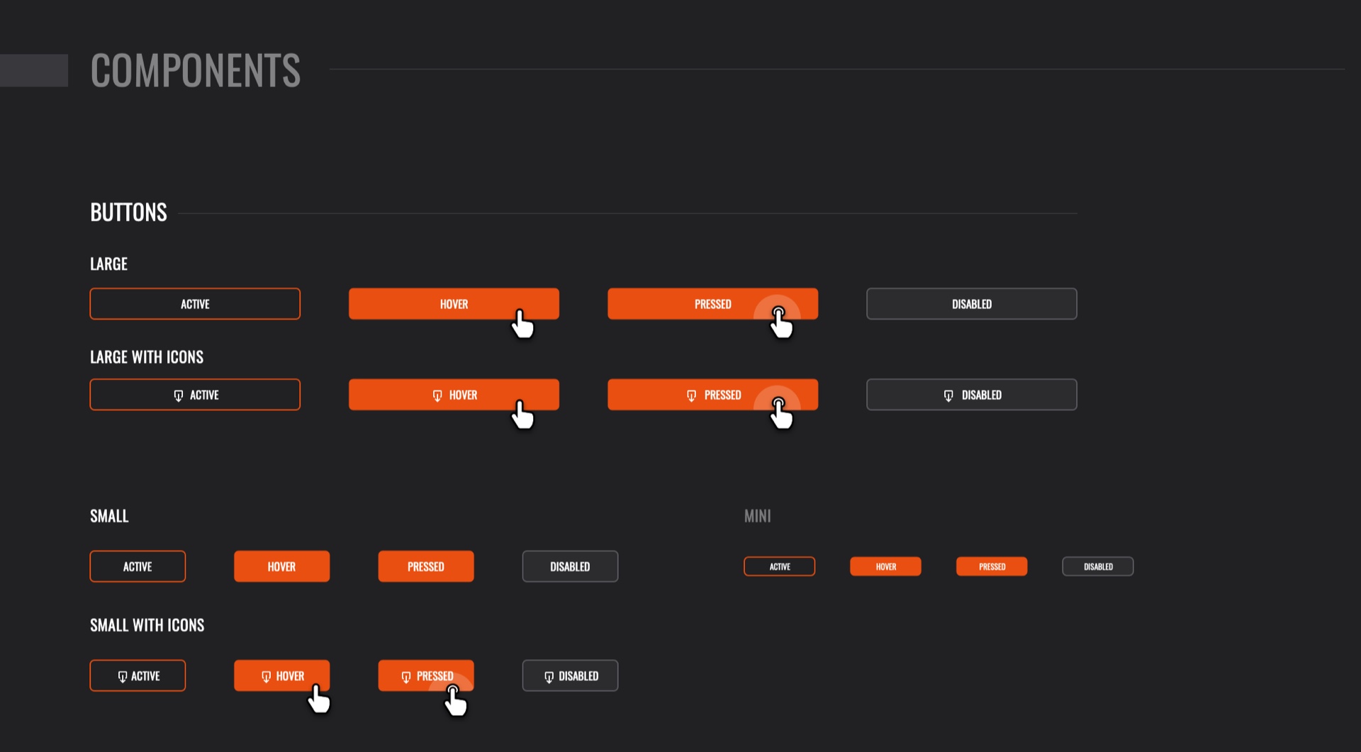
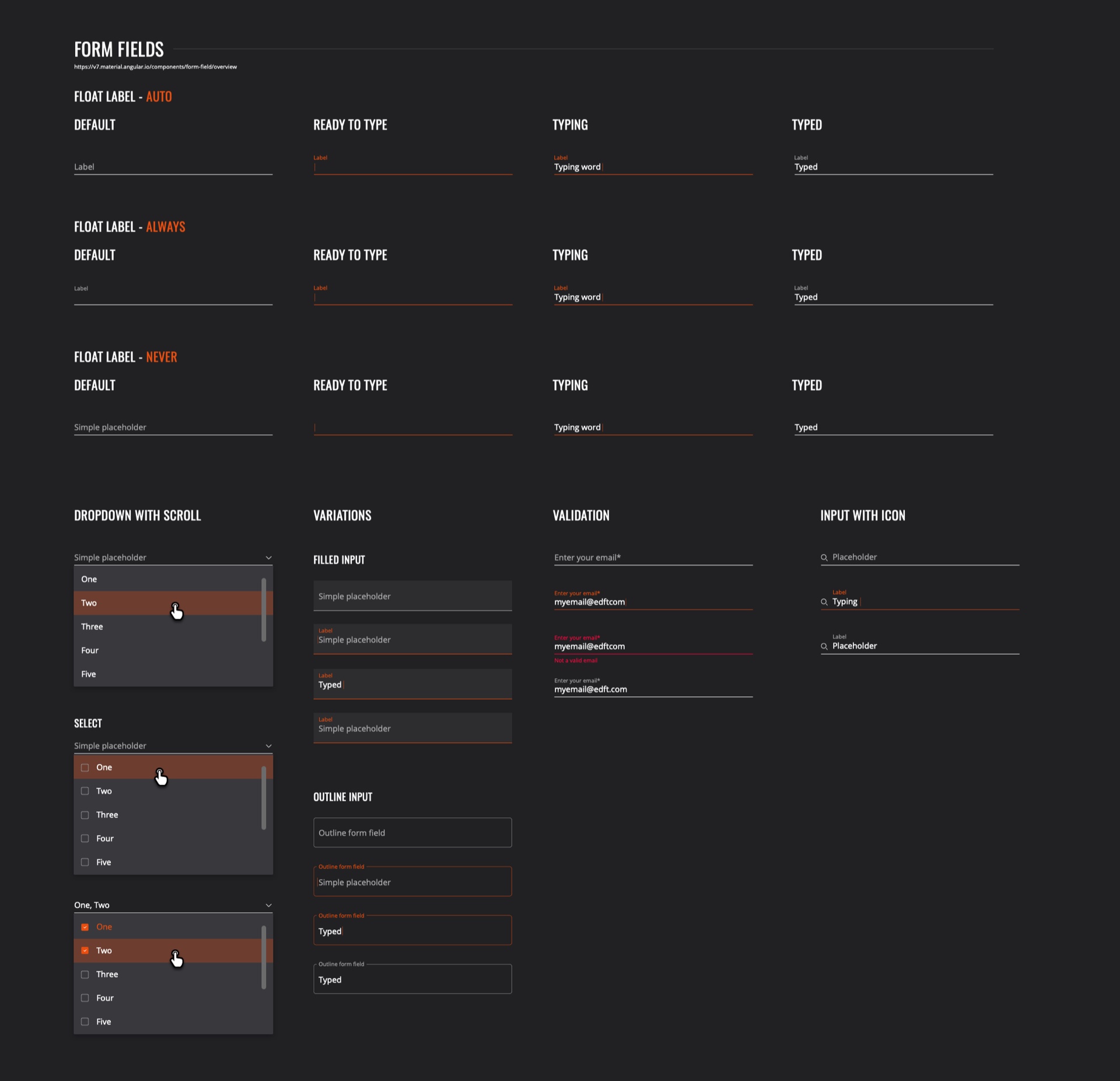
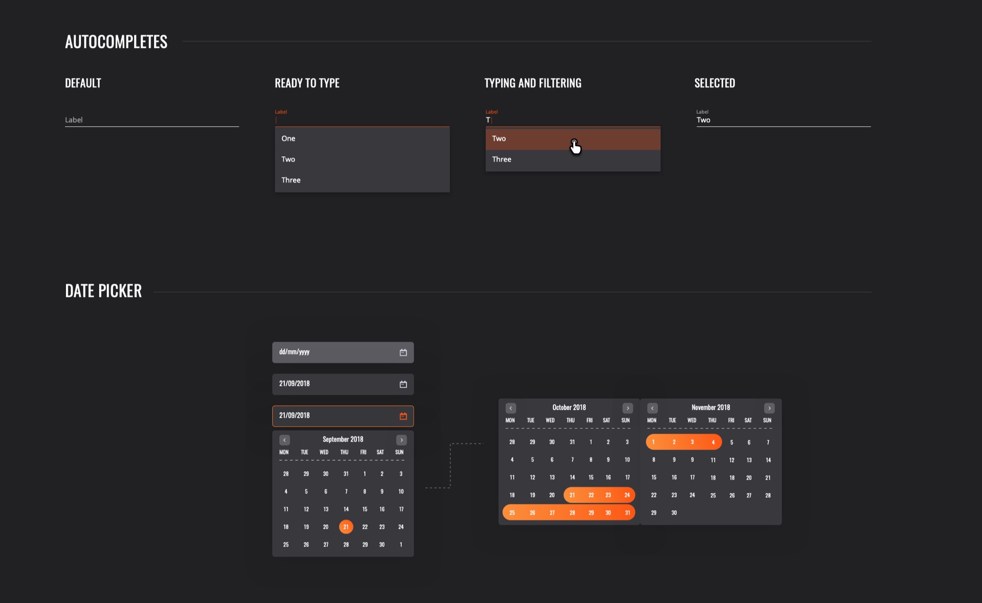
As the project progressed, designs and patterns began to emerge clearly. Recognizing this as the perfect opportunity, I started consolidating all the components into a single document. This document was set to evolve into a comprehensive Design System over time.
Conclusion
The iterative testing process provided critical insights at every stage of the development, ensuring the final product not only resolved initial usability concerns but also enhanced overall user satisfaction and efficiency. Continued monitoring and periodic testing post-launch will help in maintaining high usability standards and adapting to evolving user needs.
Moreover, I was pleased with how well the introduction of User-Centric Design was received by the teams I worked with. As other teams observed the quality and success of the Gas Balance Builder webapp, demand for my expertise grew. This led to more teams seeking my consultation during the early stages of their projects, which was a very positive outcome.
Although there was still much work to be done, I was encouraged by the positive impact of my contributions. The new ways of working had clearly made a significant difference, and I was fortunate to receive incredibly positive feedback.
“Ever since we got the new app, it's been a breeze to sift through data and pass it on to other teams. It's quick, insightful, and honestly, a total game-changer for our day-to-day."
Don R.
“Love the new 3D globe dashboard! It's literally changed how I see the market. Spotting trade opportunities has never been faster or clearer."
Brian B.
"This new platform has speed up our decision-making like nothing else. Having everything in one place, plus great visuals, really helps us stay sharp and strategic. It's been a huge boost for our business."
David C.
01
02
03
